 Truora
Truora: A new product in less than 3 months
El aumento en el uso de WhatsApp ha llevado a que los correos electrónicos queden en segundo plano, afectando los procesos de onboarding. ¿Cómo podemos trabajar en Truora para resolver este problema?
 Yaydoo
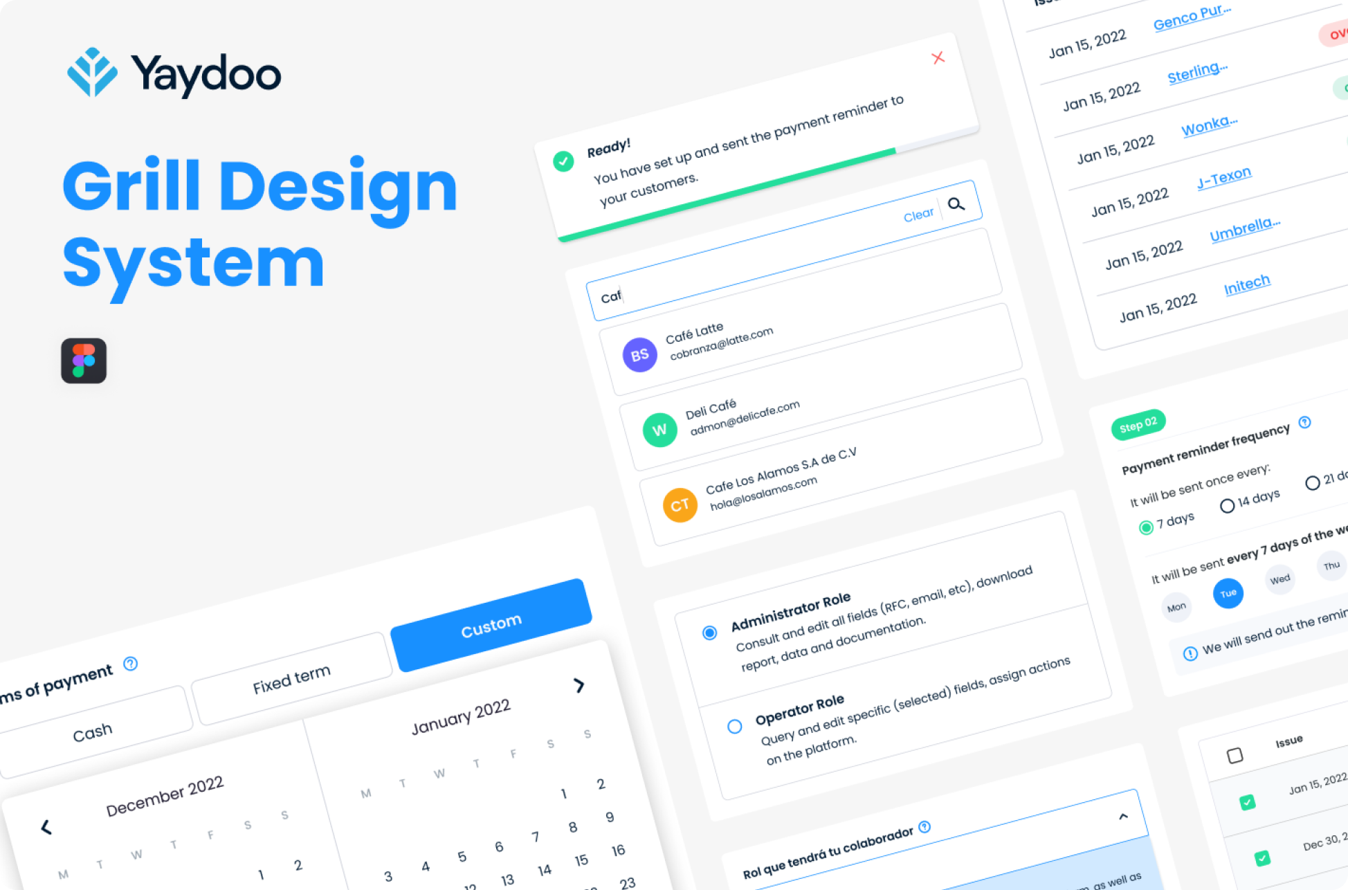
Yaydoo: Optimizing products, equipment and experiments
We took on the challenge of organizing +6 products with strong brand and usability inconsistencies. Increased productivity by +40%.
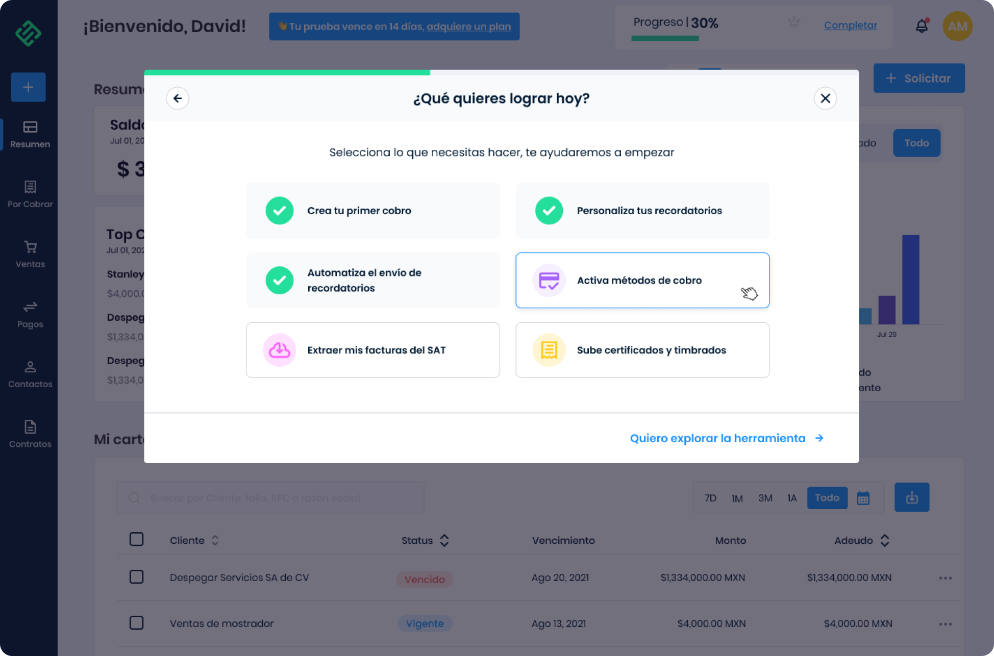
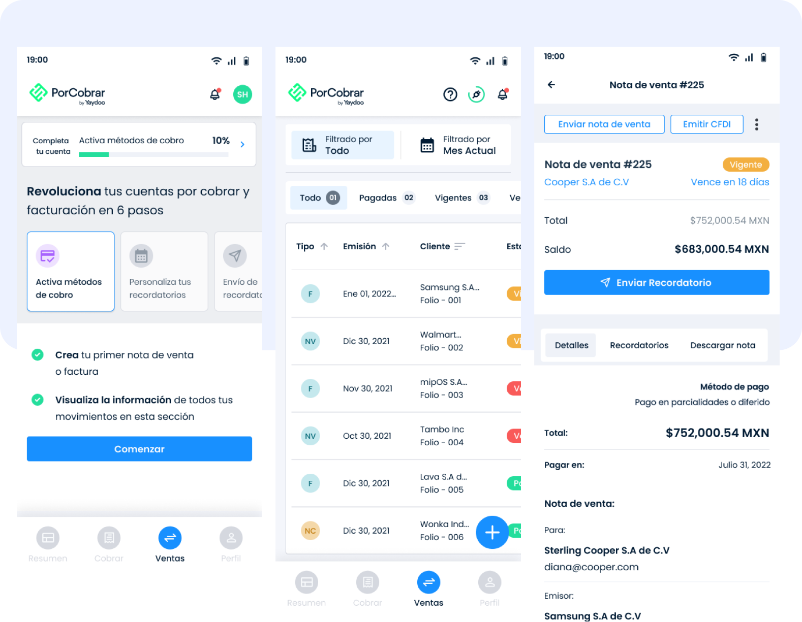
 Yaydoo porCobrar
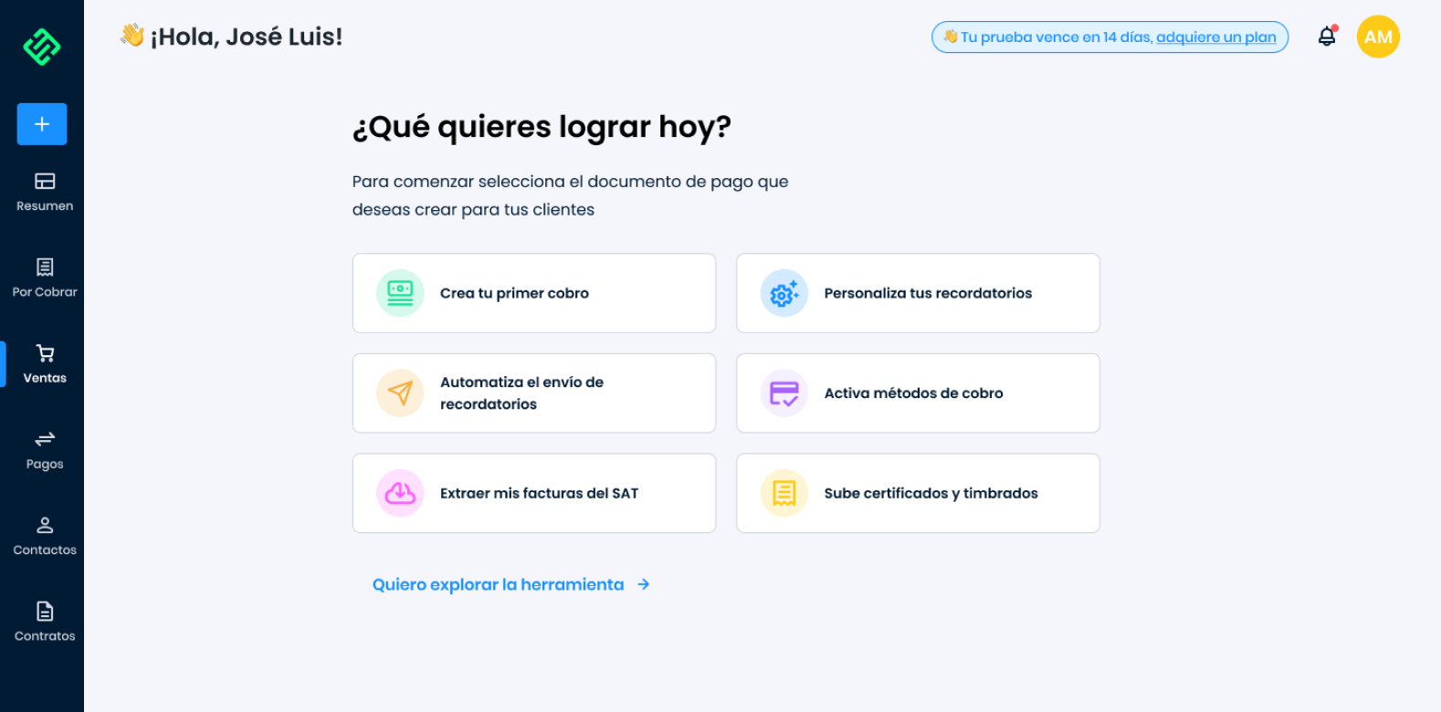
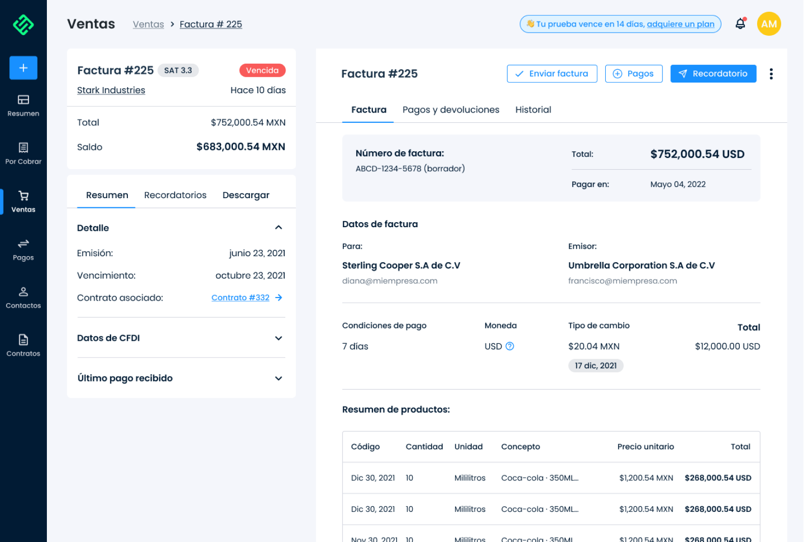
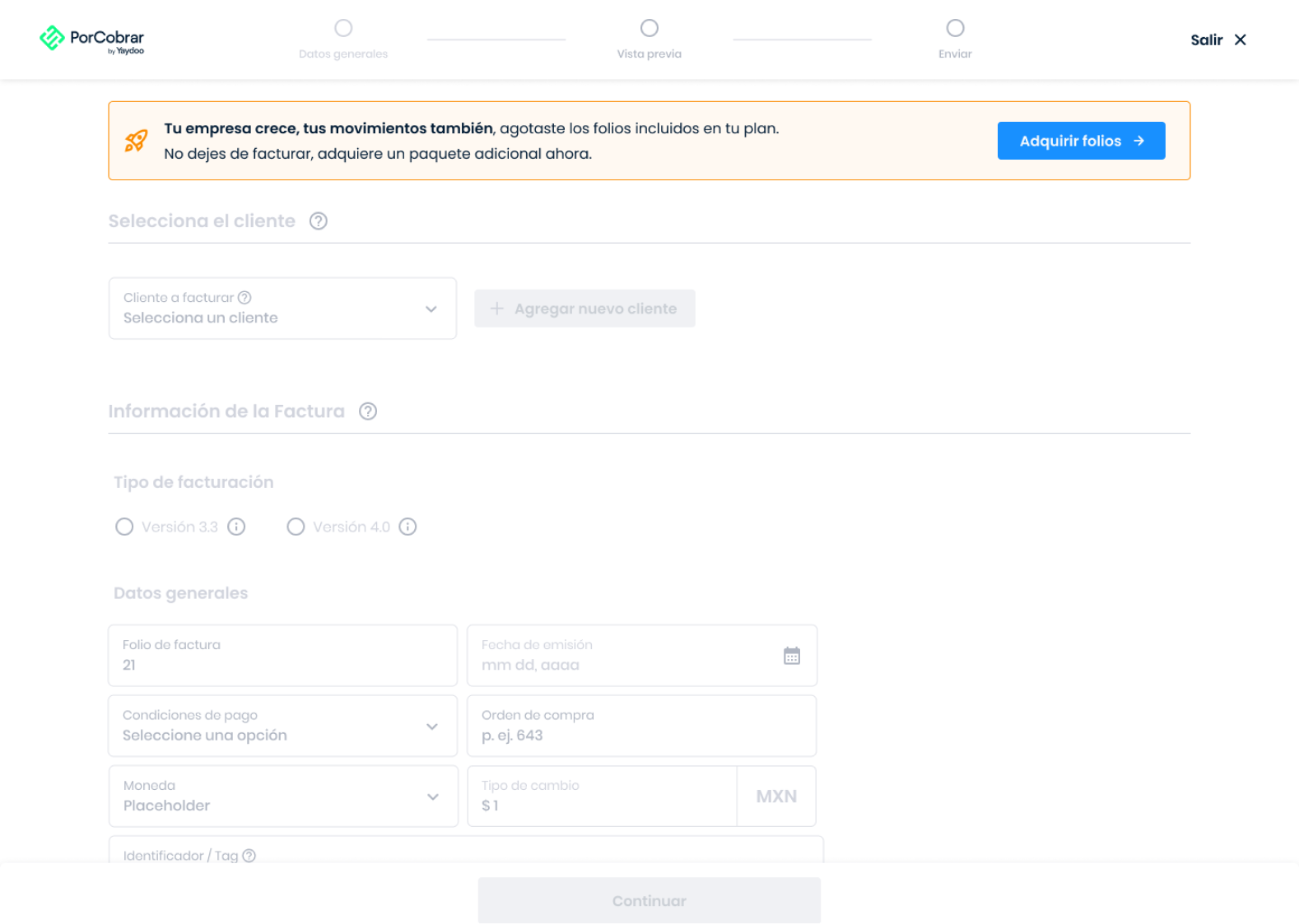
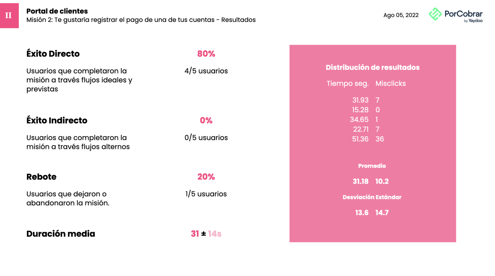
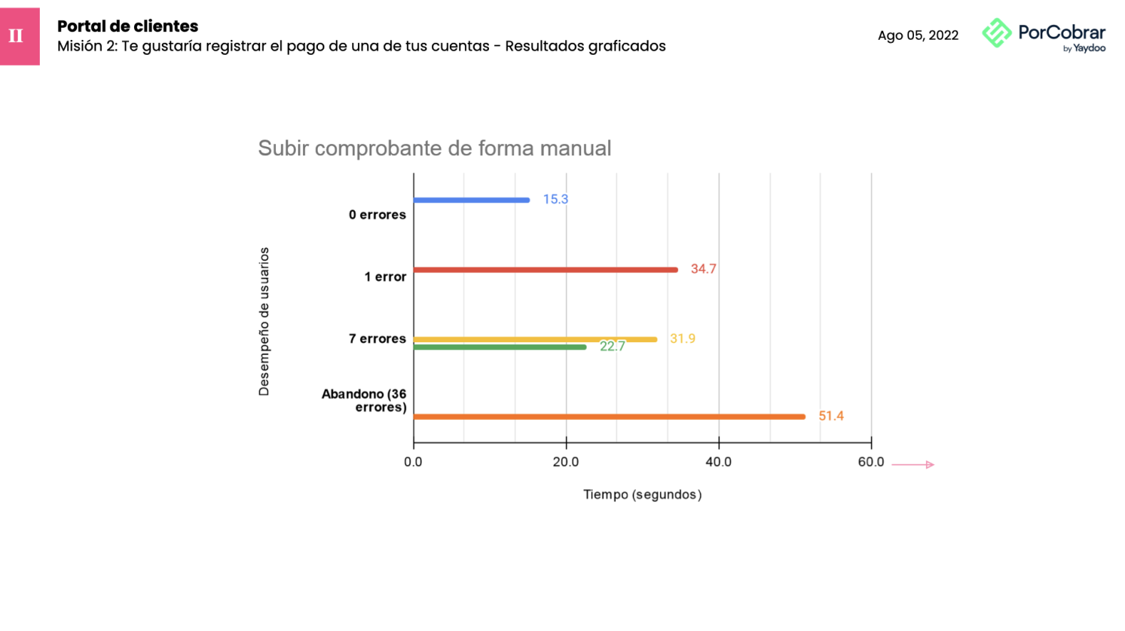
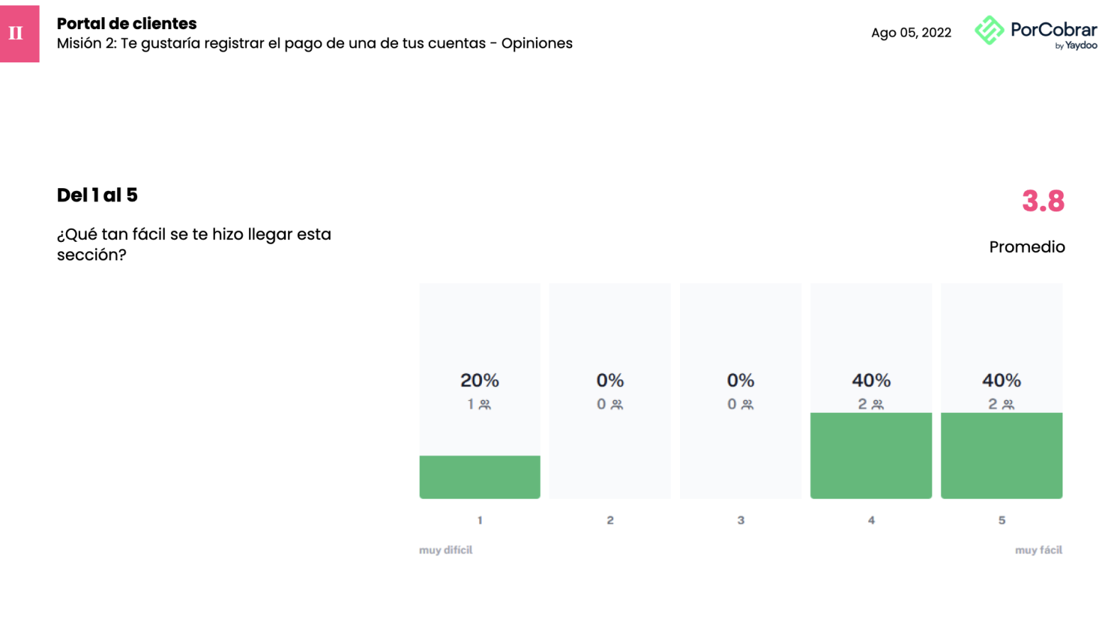
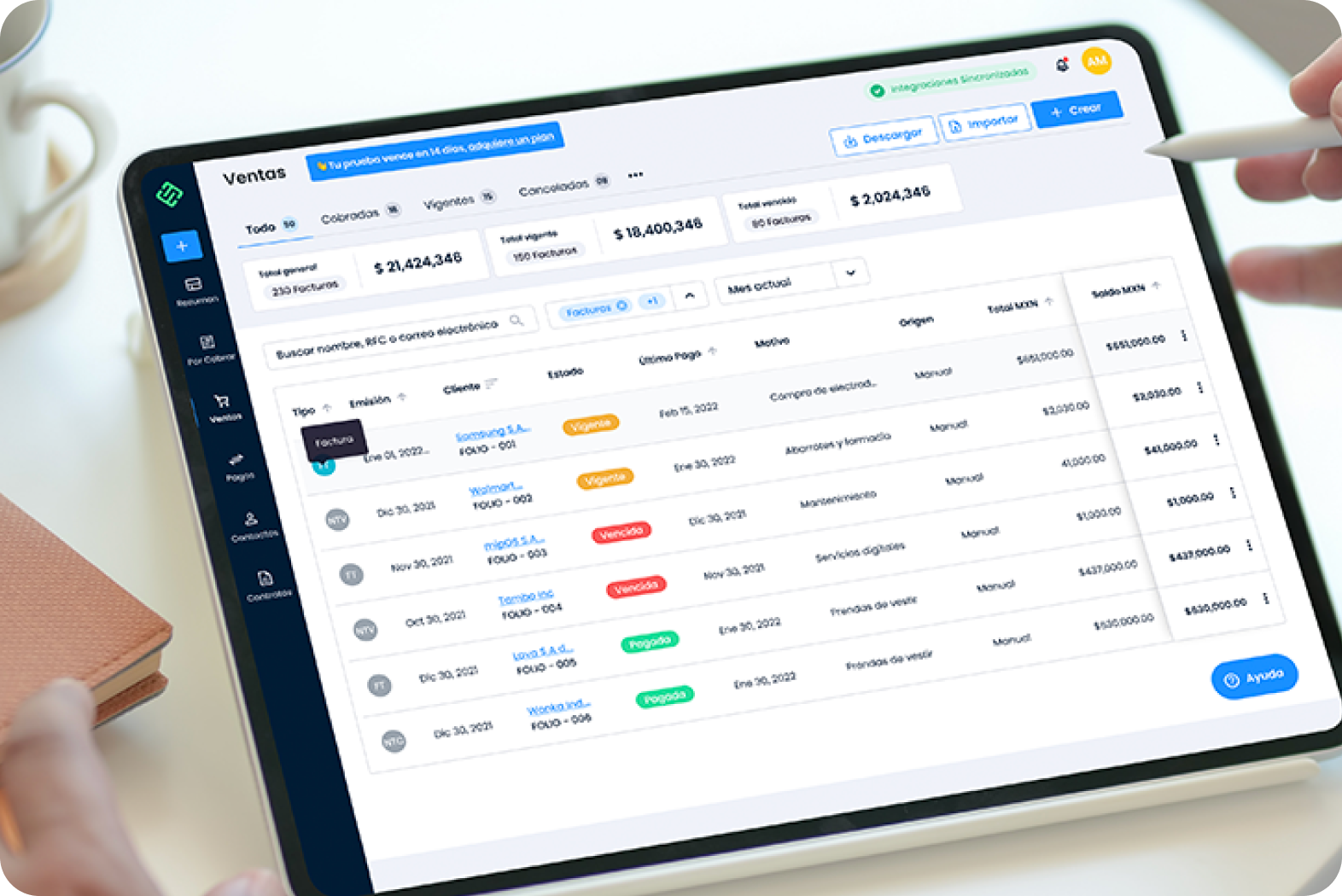
Yaydoo porCobrar: +40% new users in one week
We went into a product that had been on the market for 2 years to improve your experience and make more companies want to use porCobrar as their financial logbook.
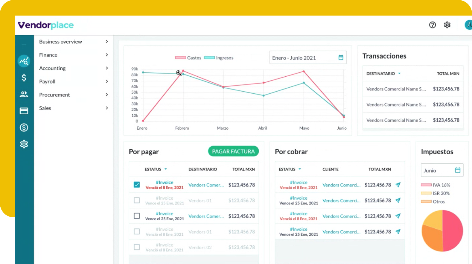
Yaydoo VendorplaceYaydoo Vendorplace: More than double the numbers of registered users
Improving the user experience in a new product that is looking for its product-market-fit can be as challenging as it is frustrating. We got to work and share the results with you.
 Stadio
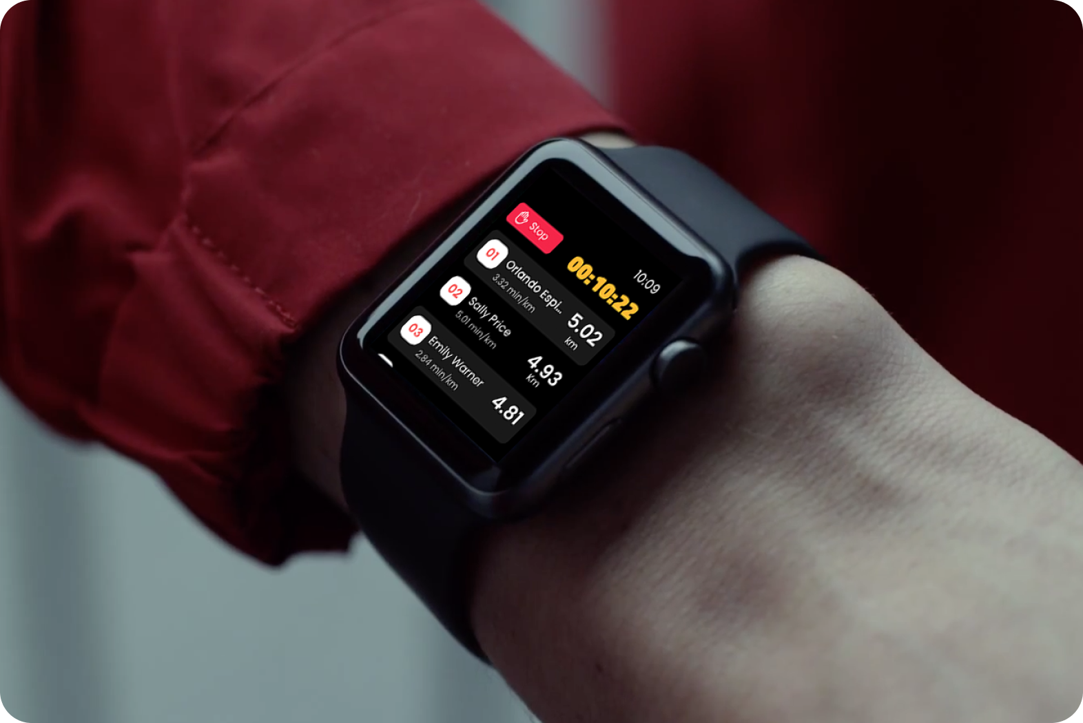
Stadio: 30% new riders in two weeks
No matter where you are, meet up with friends to run as if you were all in the same place.We achieved rapid adoption during the pandemic through Apple Watch.
 RebajaTusCuentas
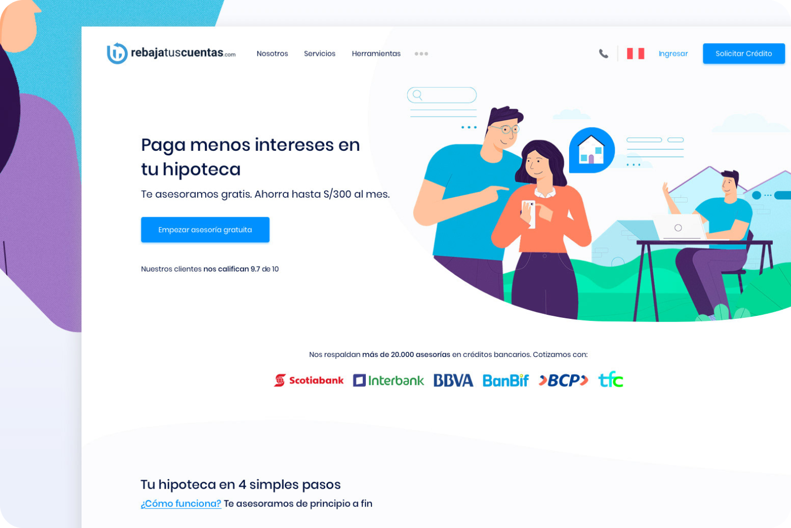
RebajaTusCuentas: +300% growth and expansion to 3 countries
A financial platform for mortgage loans that after 6 months of implementation grew exponentially with operations in 3 countries.
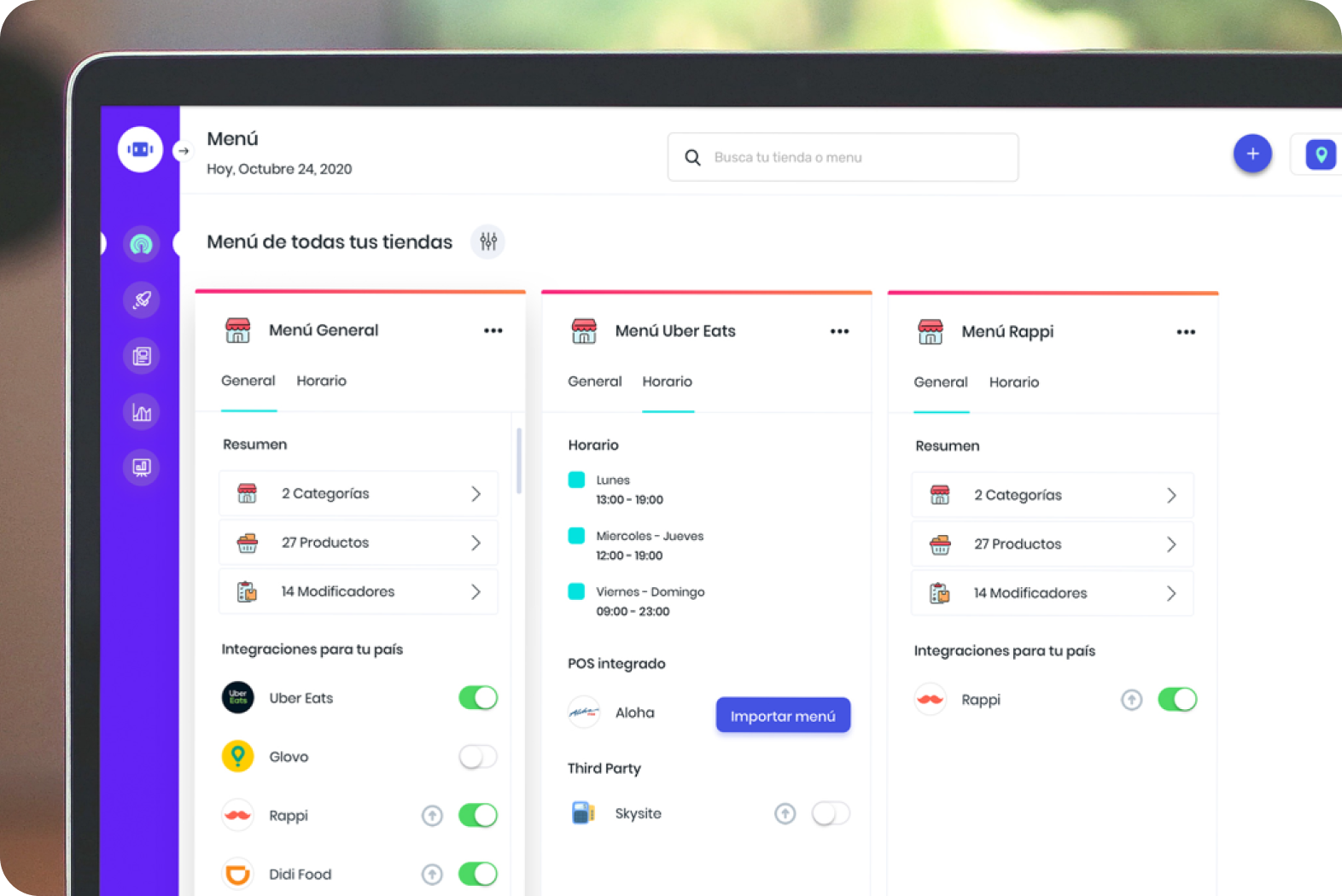 mipOS Dark Kitchen
mipOS Dark Kitchen: +400% productivity increase in Dark Kitchen
We were able to concentrate the work of +40 tablets on a single screen. Imagine having 3 tablets (Uber Eats, Rappi and Didi Food) for every digital food brand a restaurant has. Now imagine having 30 hidden kitchens.
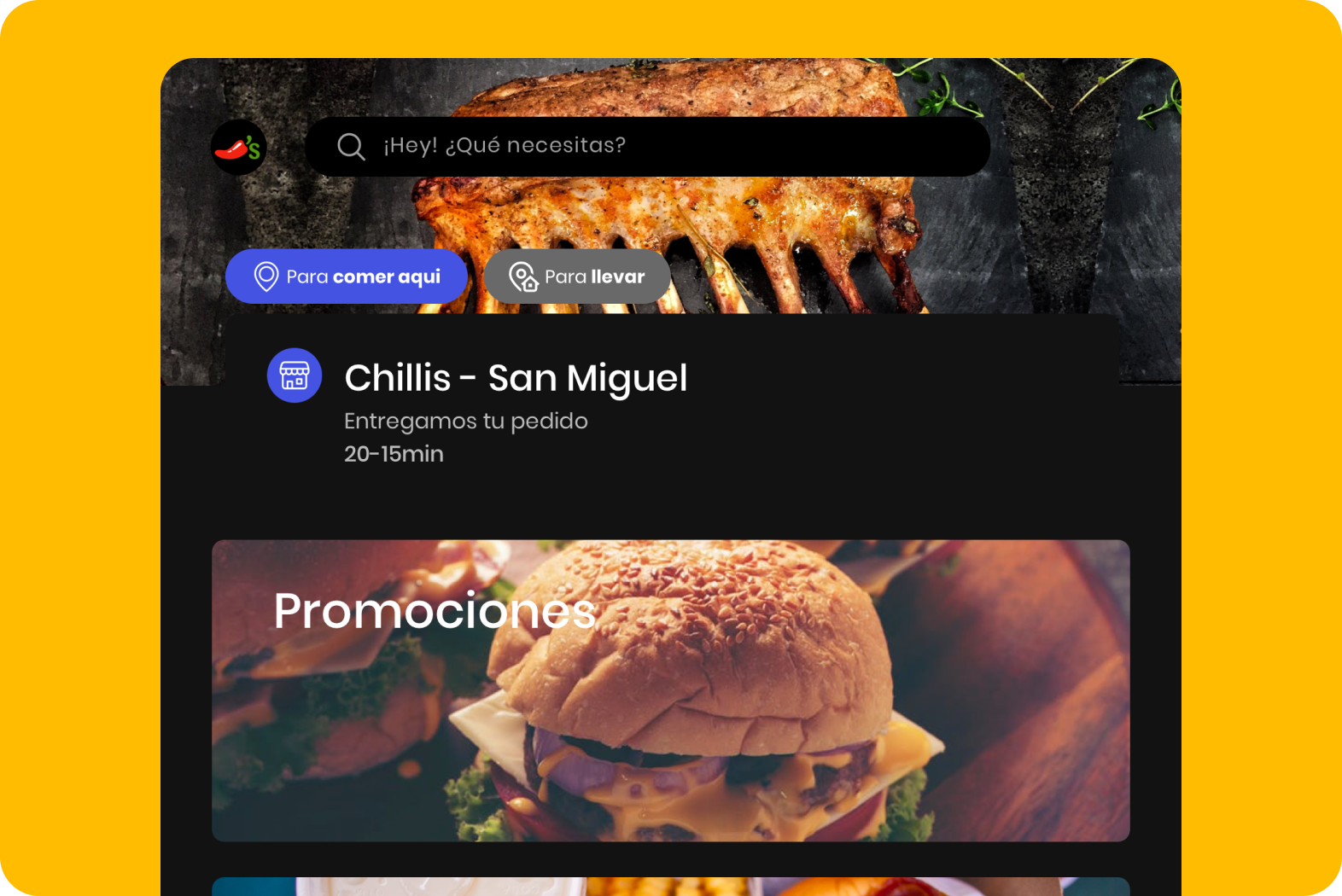
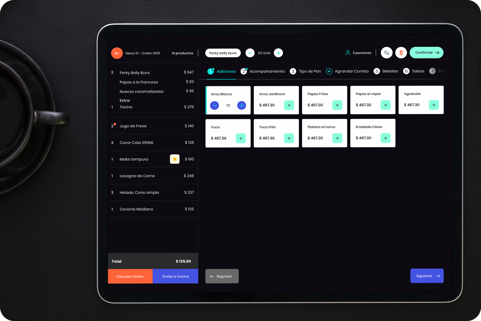 mipOS Restaurantes
mipOS Restaurants: 70% conversion rate of end customers
Backed by older operating systems, a great POS for the new generation of consumers.