Fraud — SaaS
Truora Background Check Report Case Study: -50% Reading Time
Design case study for Truora's background check PDF report. Redesigned for non-technical users. Results: -50% reading time, +85% satisfaction.
- Impact
- -50% reading time
- Timeline
- 30 days

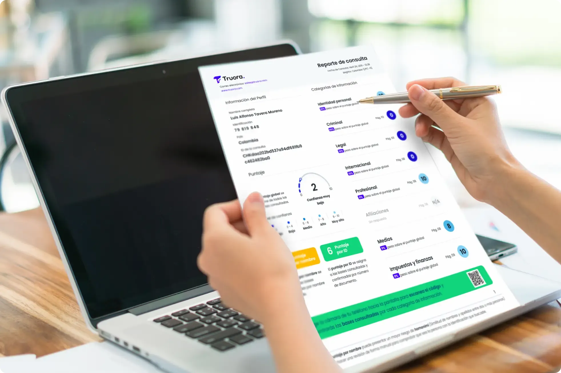
Truora's background validation report, like others in the market, was difficult for non-technical users to understand.
Improving an existing product
Properly defining the problem was tricky. We focused on the following question: How can a PDF report have an impact on the business?
I want to grow as TruoraResults
- -50% less reading time.
- +85% more satisfaction.
- +30% more efficiency (comprehension of information).
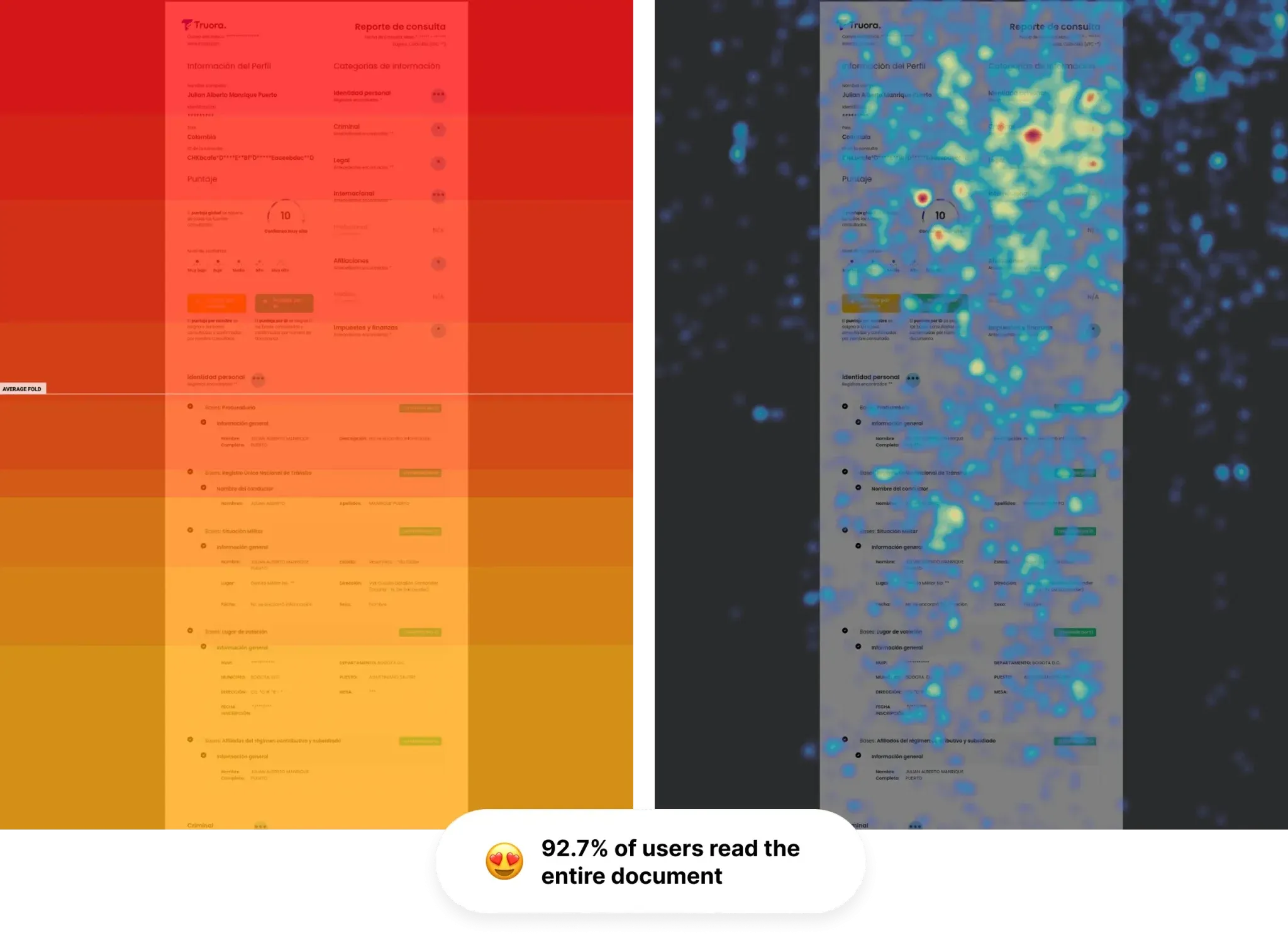
- 92.7% of users read the entire document.
The team
- 2 developers
- 2 product designer by Comandos
- 2 Customer Experience
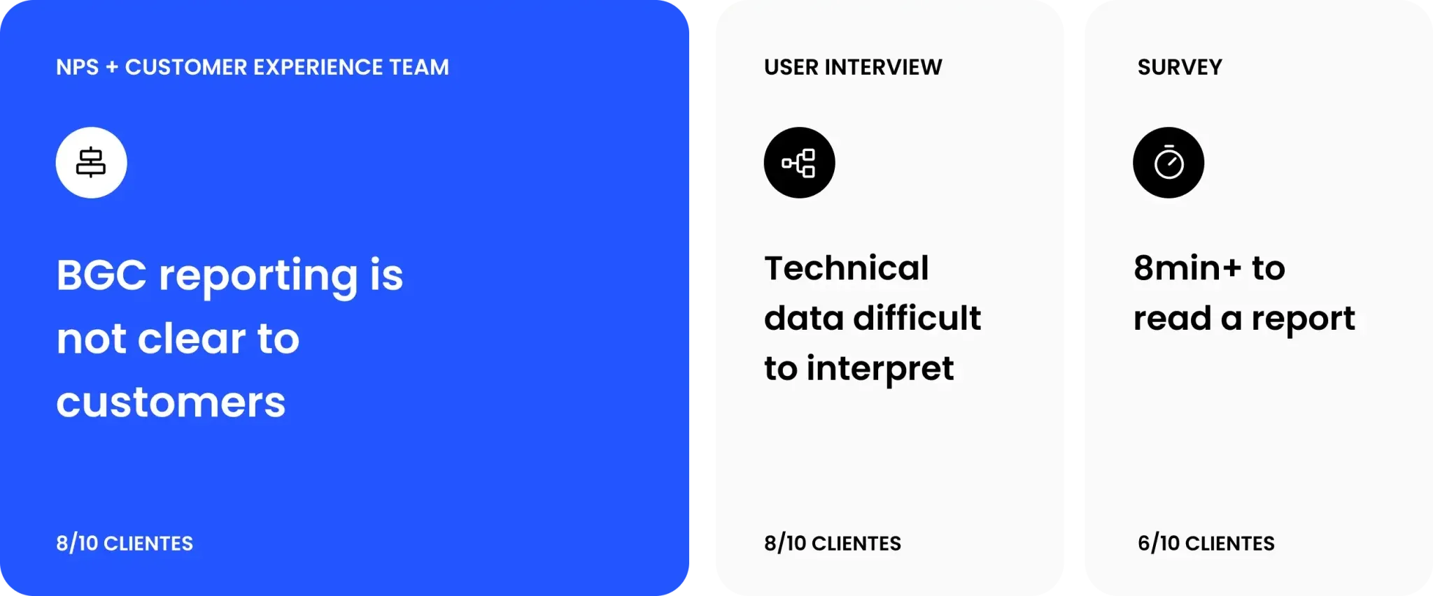
Defining top 3 challenges identified from the current report
Getting ready: Where are we? and What will we need?
- Super simplified reporting: : Reducing the complexity of the report and making it more accessible in its interpretation will improve clients' decision making.
- Continuous monitoring: : It is important to make clear the databases consulted and available during the verification process.
- Key facts: : What is the real priority for users? We must prioritize it in the reading and facilitate its interpretation.
Discovering opportunities for impact
After hitting the neurons, we identified 3 opportunities that help us make a positive impact.
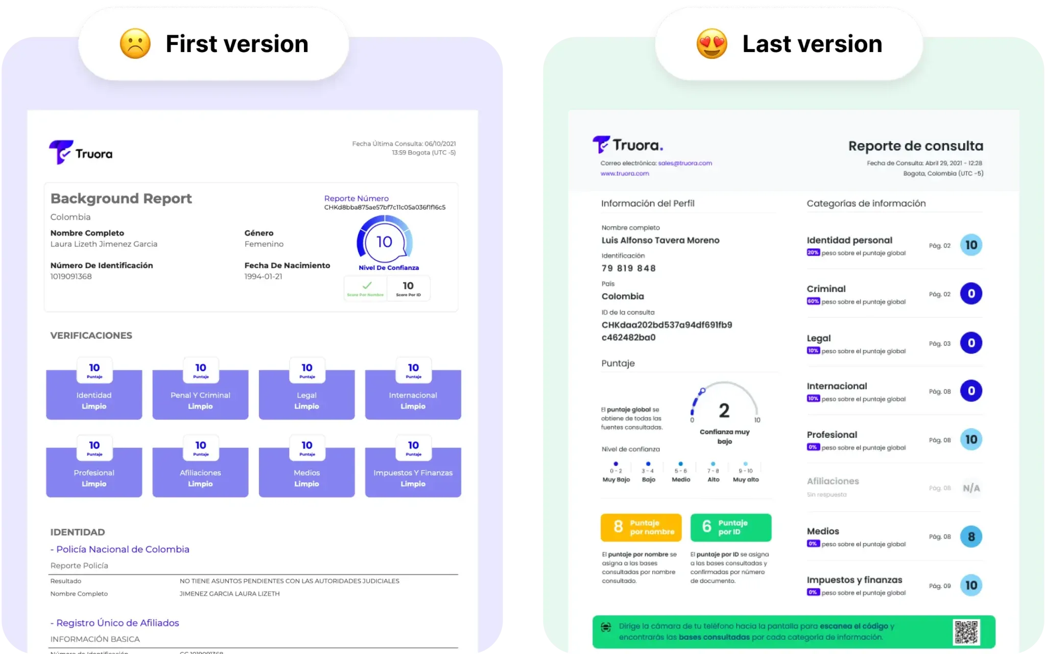
- Numbers of pages: : A "clean" Background Check resulted in eight pages without useful content. This led users to underestimate the report due to a lack of meaningful information.
- Value proposition of the report: : These reports legally support recruitment processes and legal procedures; therefore, they must be accurate and concise, facilitating analysis and decision-making.
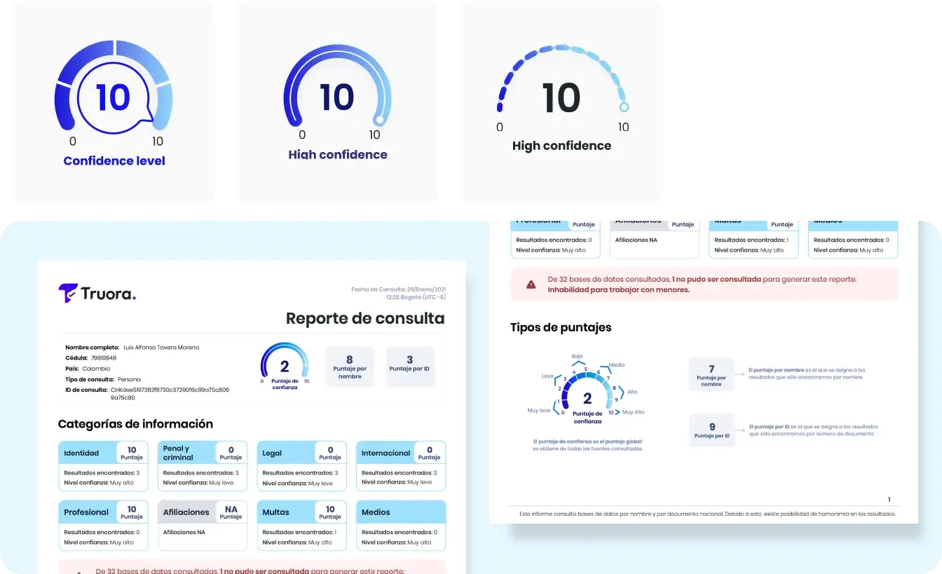
- Clear scores: : 100% of users from different countries did not understand the scores in the current reports.
We start iterating the confidence score
We began with a focus on making low-effort, high-impact corrections.
In the first week-long iteration, we achieved the following:
- 15% less pages: : We improved the information architecture, but we still needed to improve clarity.
- 7% score improvement: : Users mention that the new score is more understandable.
During the process, combining surveys, A/B testing and short experiments in production, we interacted with more than 8,000 users.

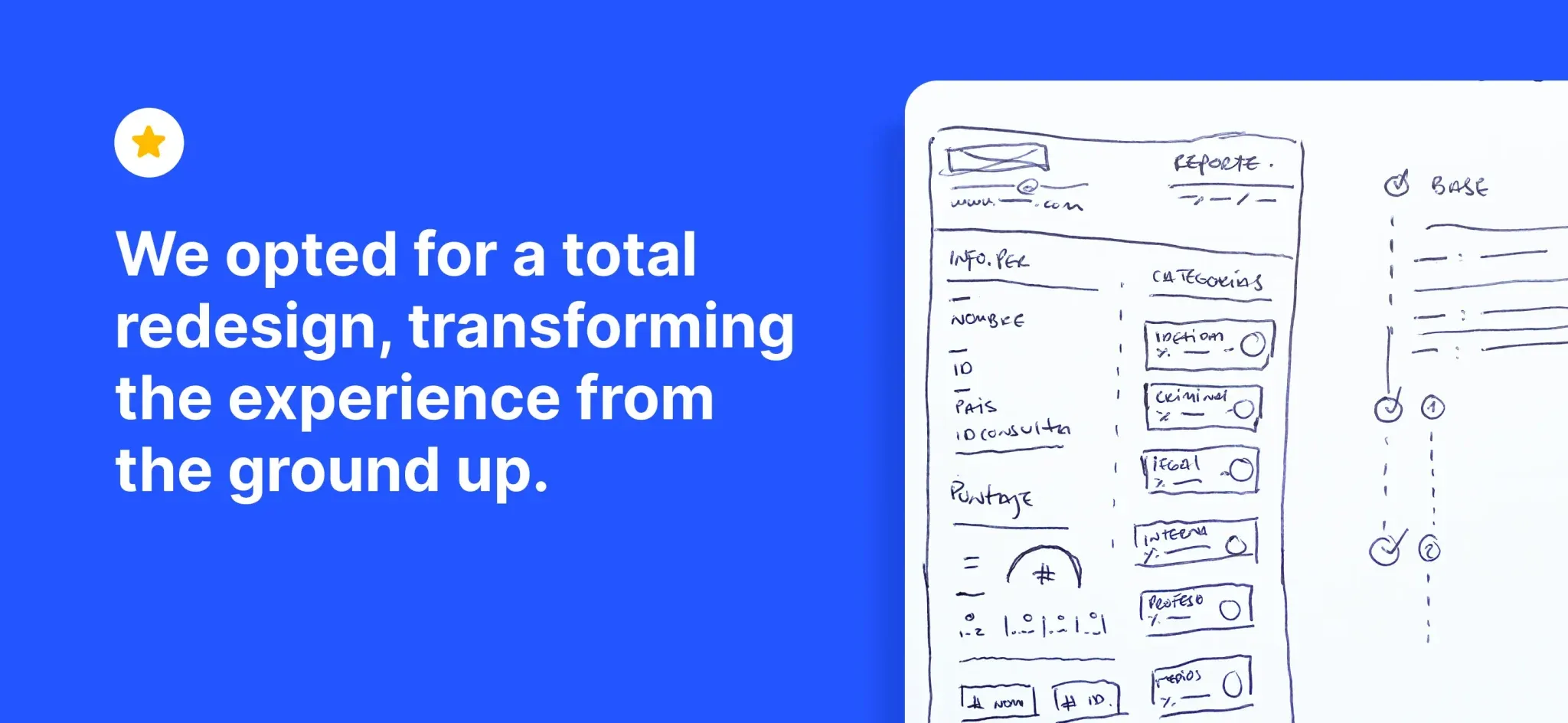
We understood that small corrections did not generate big results
We opted for a total redesign, transforming the experience from the ground up. It meant redoing many things from scratch. We had 30 days to make a big impact, and we only had three weeks left.
We take all the insights and create something unique.
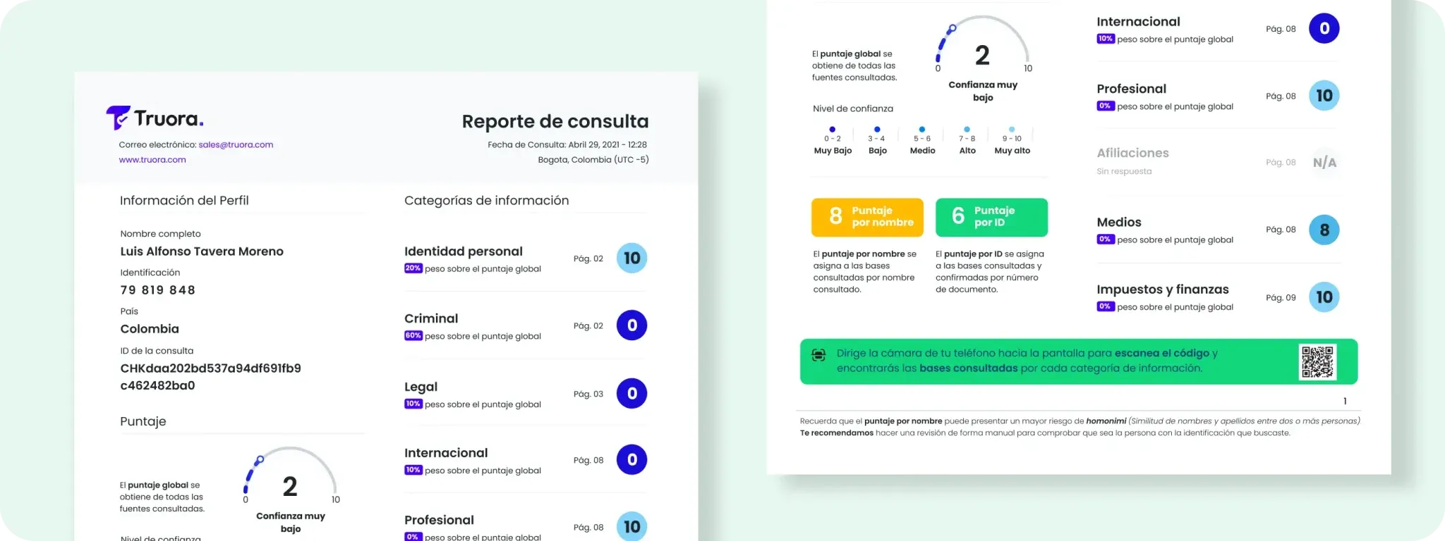
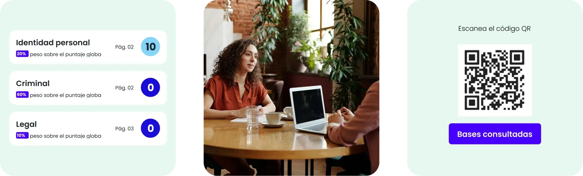
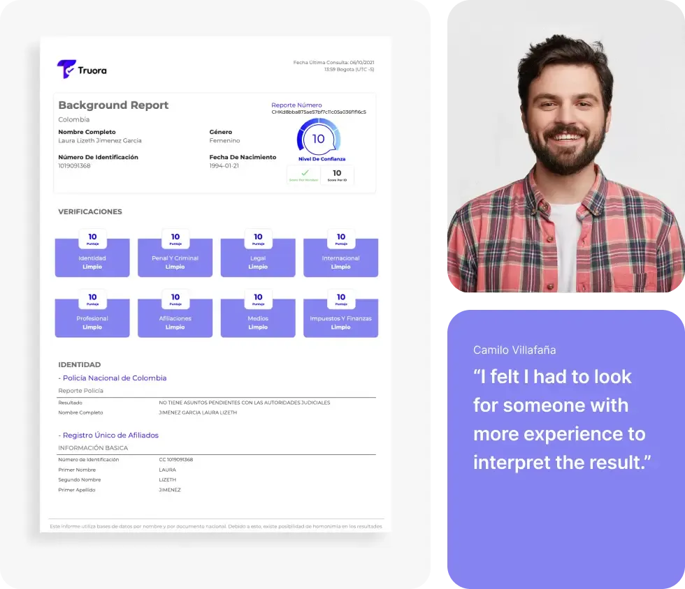
- 69% less pages: : We simplified the structure of the report, eliminating unnecessary technical information to improve clarity and understanding.
- 100% component redesign: : Intuitive graphics and visual labels highlight key information instantly.
- 147% more effective: : Users can make informed decisions more quickly and accurately.
More than 8k users put our design to the test
A great result in less than 30 days
Results? More intuitive and effective report
- -50% less reading time
- Users understand the report in half the time.
- +85% more satisfaction
- Better perceived clarity and ease of use.
- +99% optimized accuracy
- More accurate validations with prioritized information.
Keep exploring