Fraud - SaaS
Background Check Report that can be understood in seconds.
Truora’s background validation report, like others in the market, was difficult for non-technical users to understand.
- Challenge
Improving an existing product
Properly defining the problem was tricky. We focused on the following question: How can a PDF report have an impacto on the business?
Results
- -50% less reading time.
- +85% more satisfaction.
- +30% more efficiency (Comprehension of information)
- 92.7% of users read the entire document.
The team
- 2 developers .
- 2 product designer by Comandos
- 2 Customer Experience.
- Adventure
Defining top 3 challenges identified from the current report
Getting ready: Where are we? and What will we need?
- Super simplified reporting: Reducing the complexity of the report and making it more accessible in its interpretation will improve clients' decision making.
- Continuous monitoring: It is important to make clear the databases consulted and available during the verification process.
- Key facts: What is the real priority for users? We must prioritize it in the reading and facilitate its interpretation.
- Seeing the mountain
Discovering opportunities for impact
After hitting the neurons, we identified 3 opportunities that help us make a positive impact.
- Numbers of pages: A "clean" Background Check resulted in eight pages without useful content. This led users to underestimate the report due to a lack of meaningful information.
- Value proposition of the report: These reports legally support recruitment processes and legal procedures; therefore, they must be accurate and concise, facilitating analysis and decision-making.
- Clear scores: 100% of users from different countries did not understand the scores in the current reports.
We start iterating the confidence score
We began with a focus on making low-effort, high-impact corrections.
In the first week-long iteration, we achieved the following:
- 15% less pages: We improved the information architecture, but we still needed to improve clarity.
- 7% score improvement: Users mention that the new score is more understandable.
During the process, combining surveys, A/B testing, and short experiments in production, we interacted with more than 8,000 users.
We understood that small corrections did not generate big resutls
It meant redoing many things from scratch. We had 30 days to make a big impact, and we only had three weeks left.
- Making top
We take all the insights and create something unique.
- 69% less pages: We simplified the structure of the report, eliminating unnecessary technical information to improve clarity and understanding.
- 100% component redesign: Intuitive graphics and visuals labels highlight key information instantly.
- 147% more effective: Users can make informed decisions more quickly and accurately.
More than 8k users put our design to the test
A great result in less than 30 days
Results?
More intuitive and effective report
50% less reading time
Users understand the report in half the time of the time.
85% more satisfaction
Better perceived clarity and ease of use of use.
99% optimized accuracy
More accurate validations with prioritized information.
We make possible,
What seems to be impossible
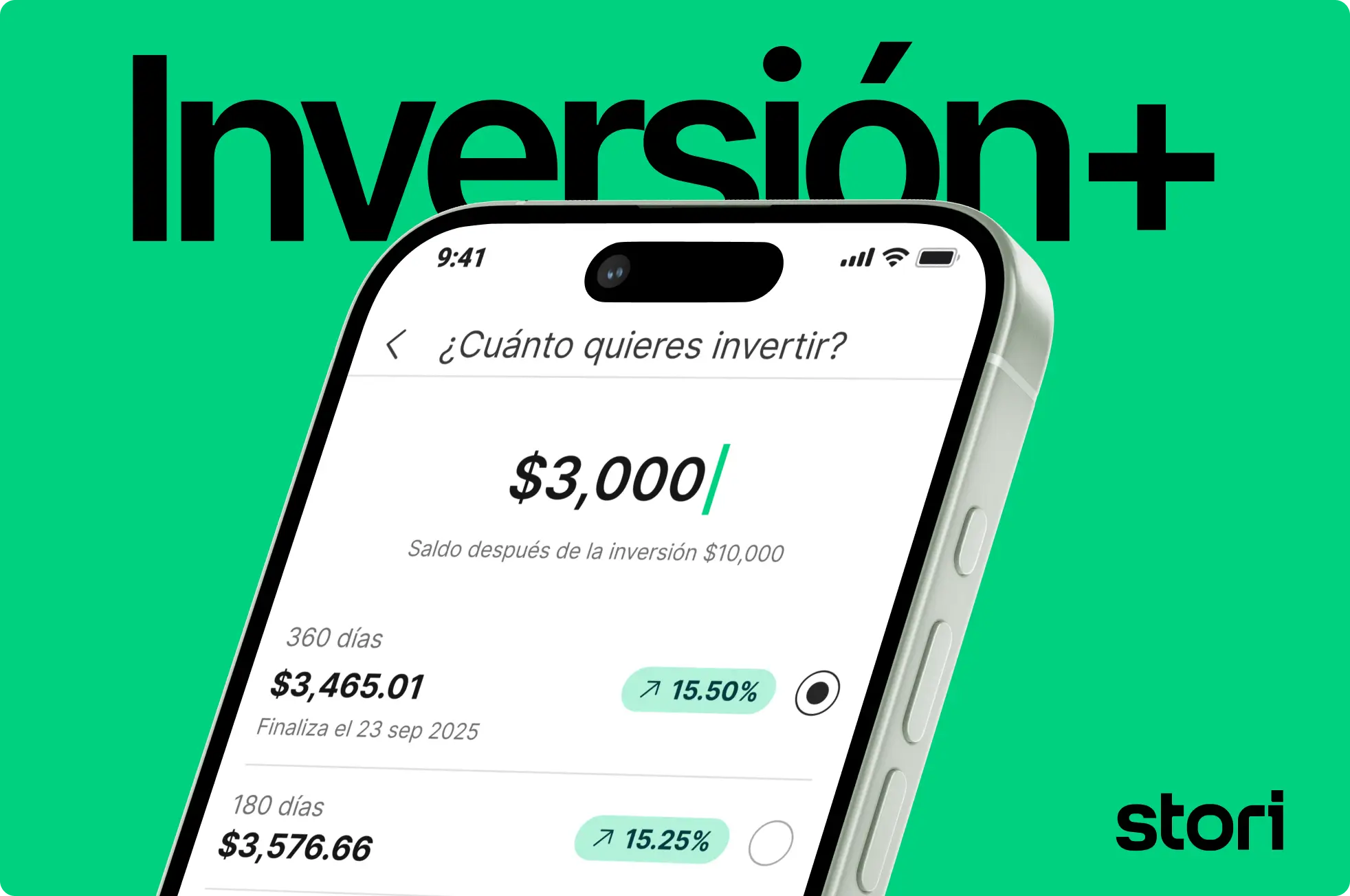
StoriStori Inversión+ Case Study: +477% Activation
Democratize returns with easy, guided investing and time-locked accounts. Offer tiered yields, goal-based locks
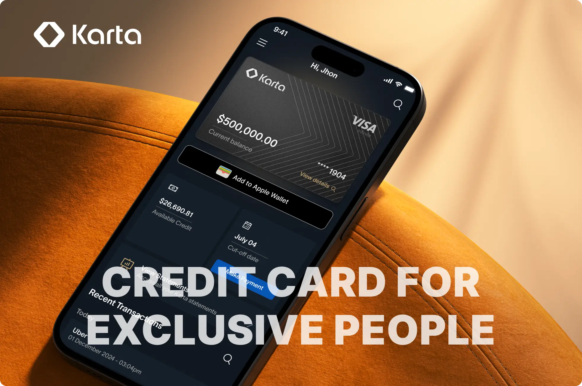
KartaKarta App Case Study: Premium Credit Card UX
Product design for Karta's premium credit card app. WhatsApp concierge integration, investment-backed payments, and 85% lower fees.
KartaKarta Card Design Case Study: AI Metal Credit Card
Industrial and brand design for Karta's physical credit card. 17g metal card with AI features and premium finish.
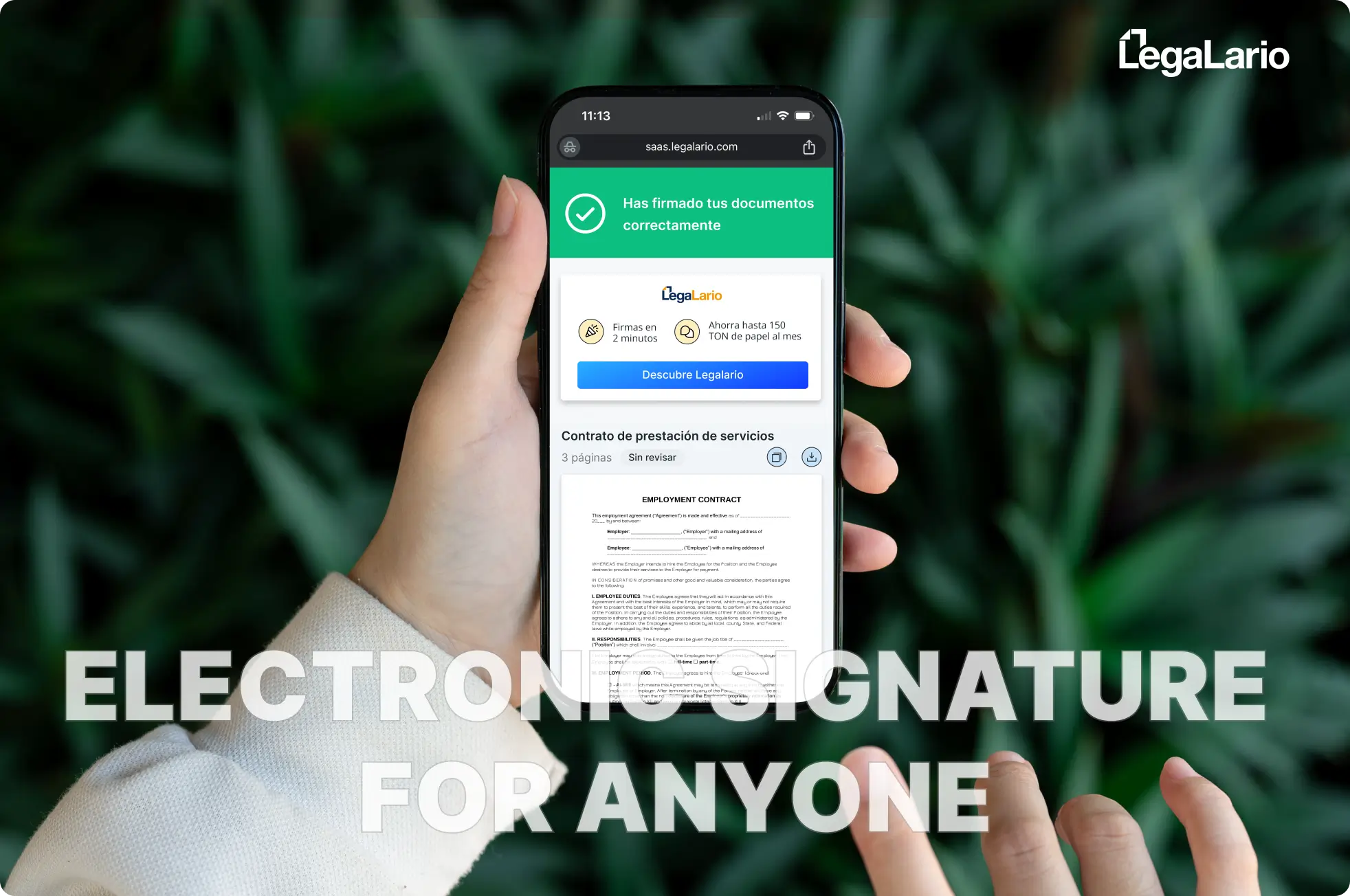
LegalarioLegalario Case Study: 99% E-Signature Completion
Product design for Legalario's electronic signature platform. Achieved 99% completion rate, +24% NPS, 4 biometric models and iBeta.
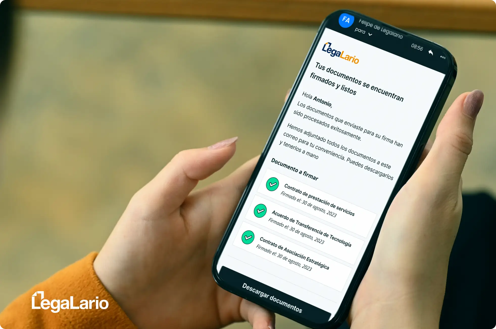
LegalarioLegalario Emails Case Study: Electronic Signature for anyone
Email redesign for Legalario's e-signature platform. Previous emails looked like spam. We redesigned invitations, reminders, and confirmation
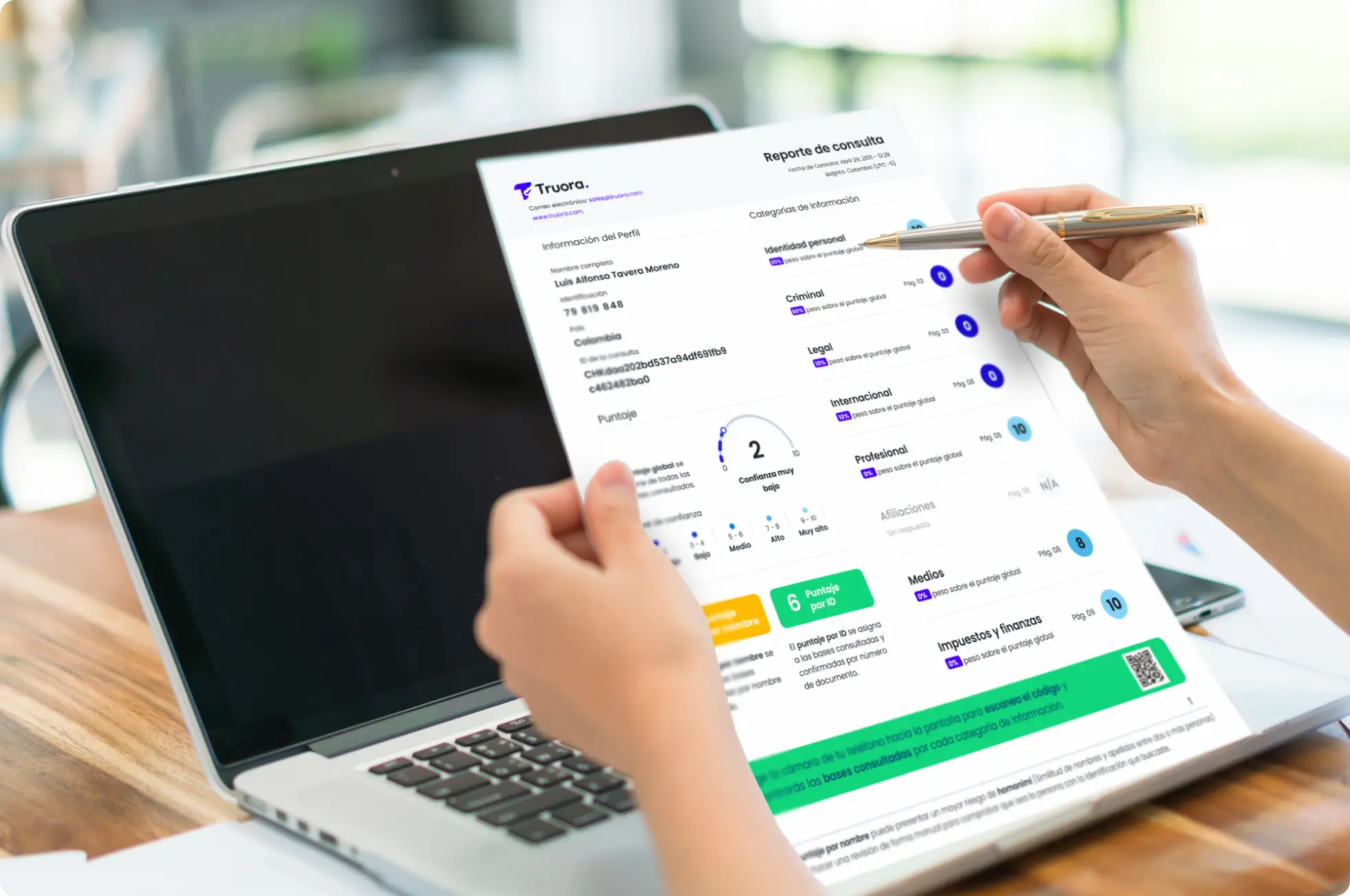
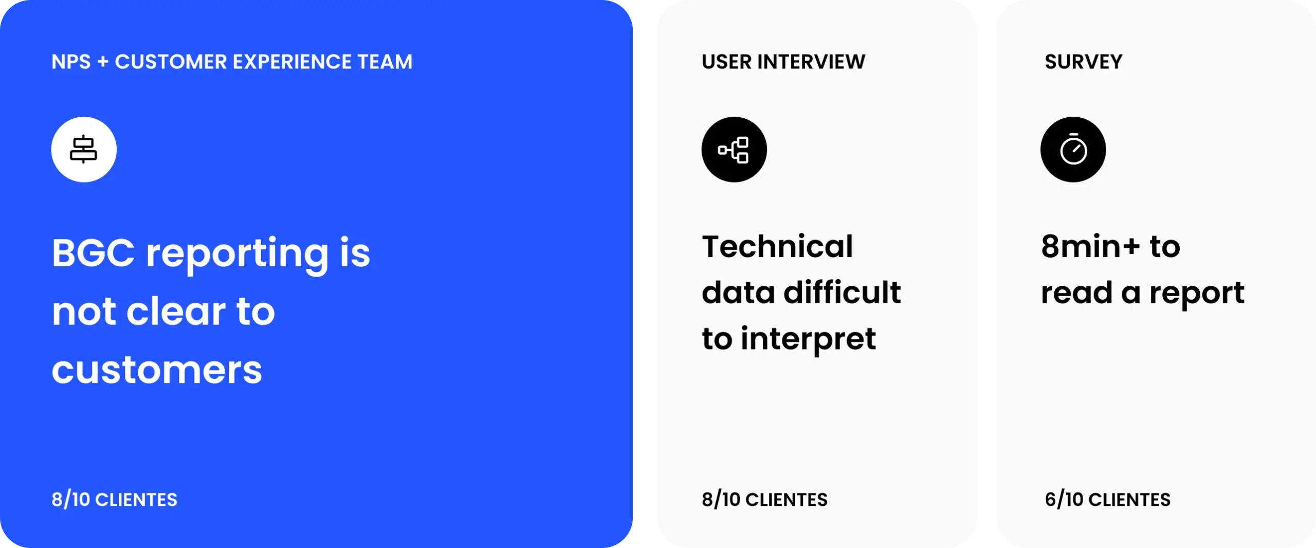
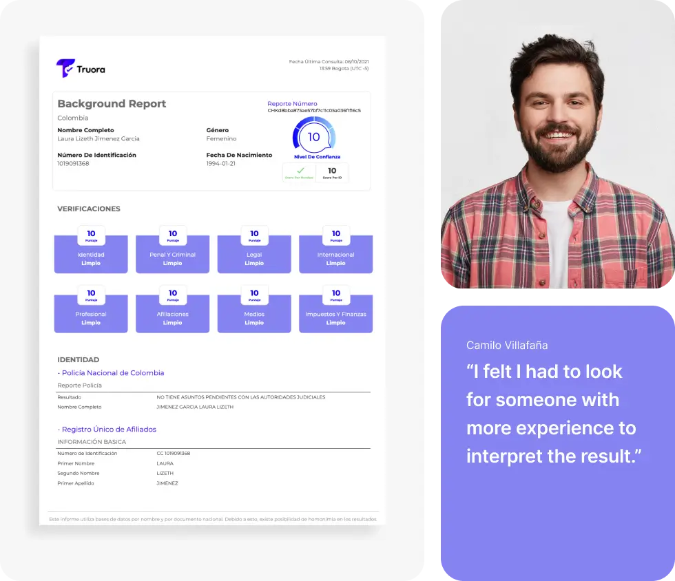
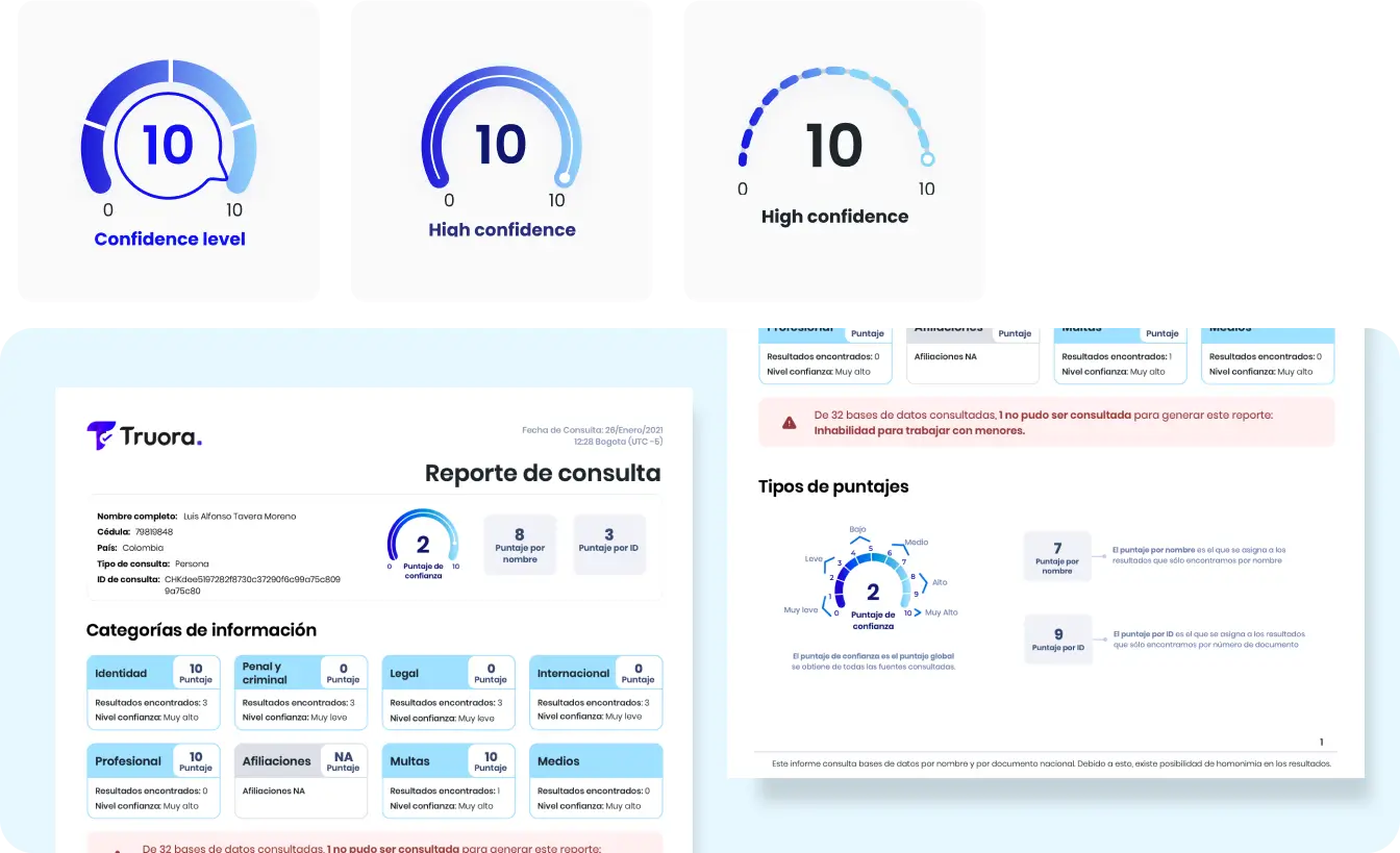
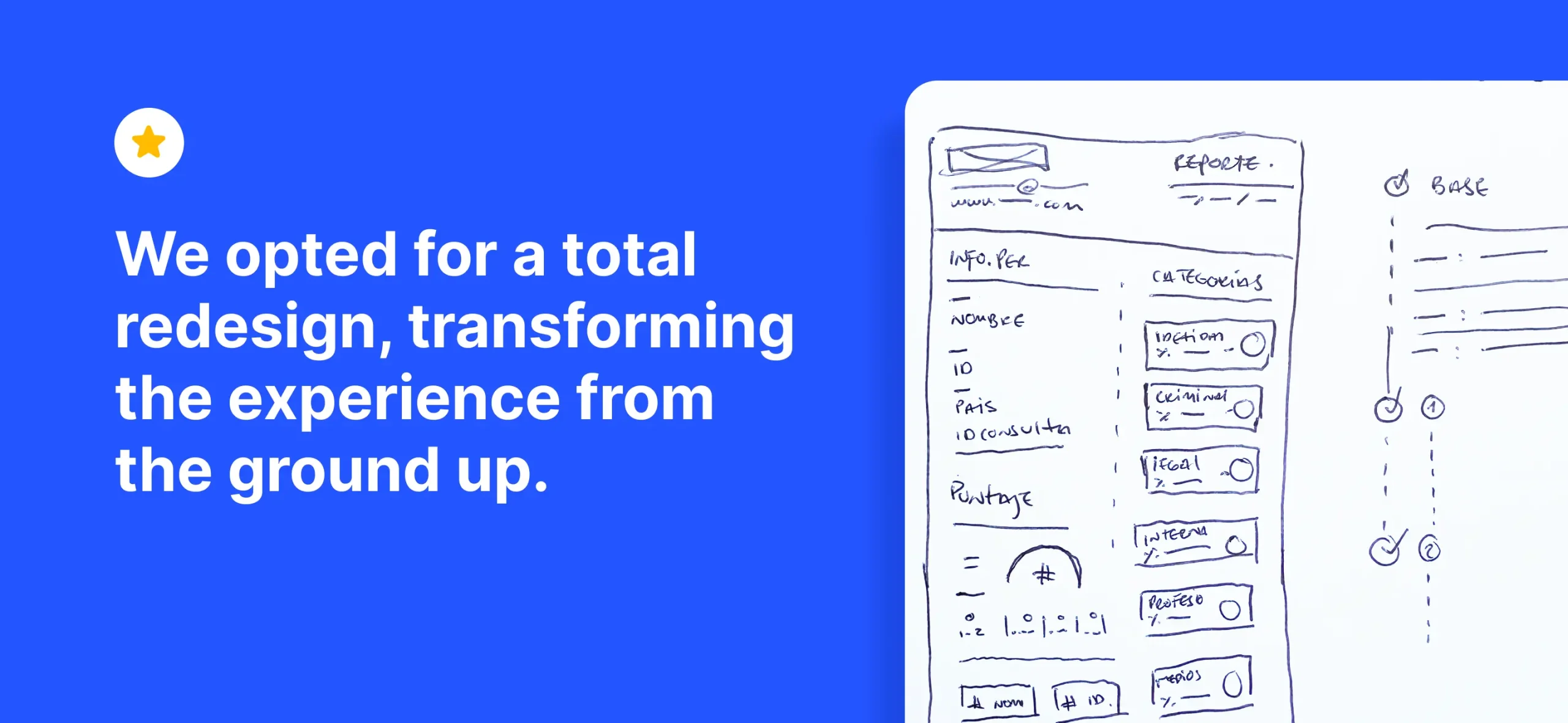
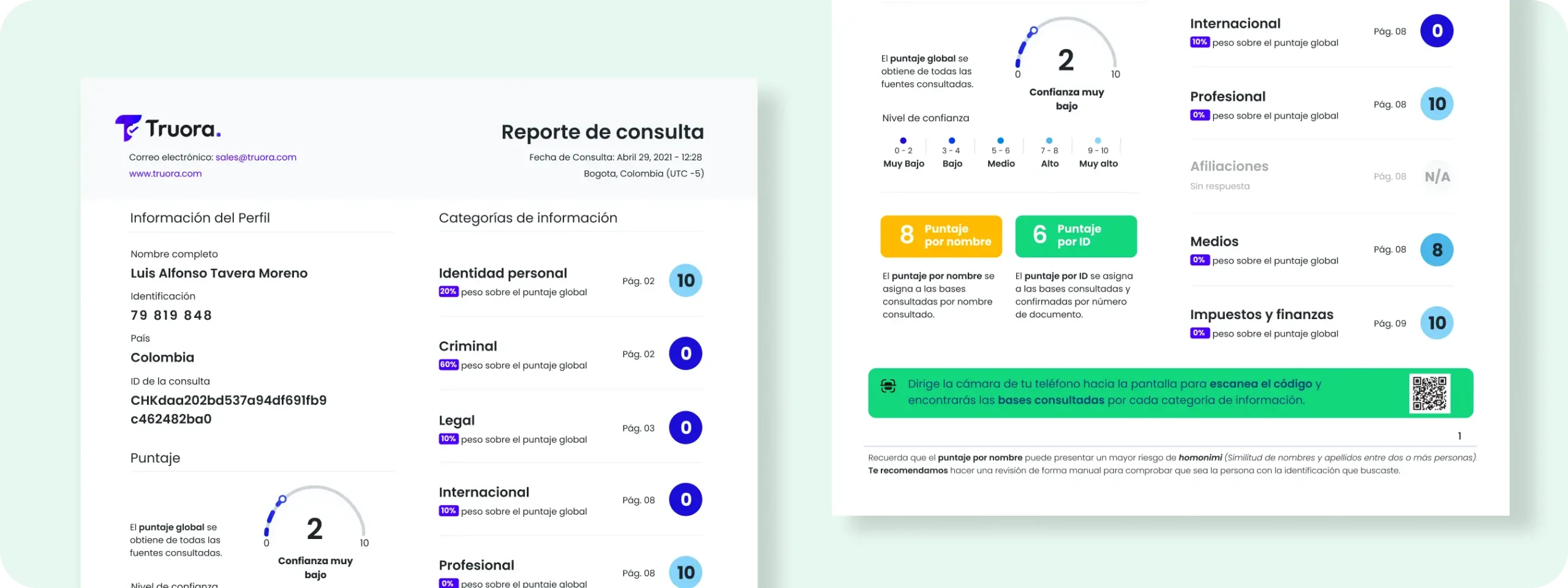
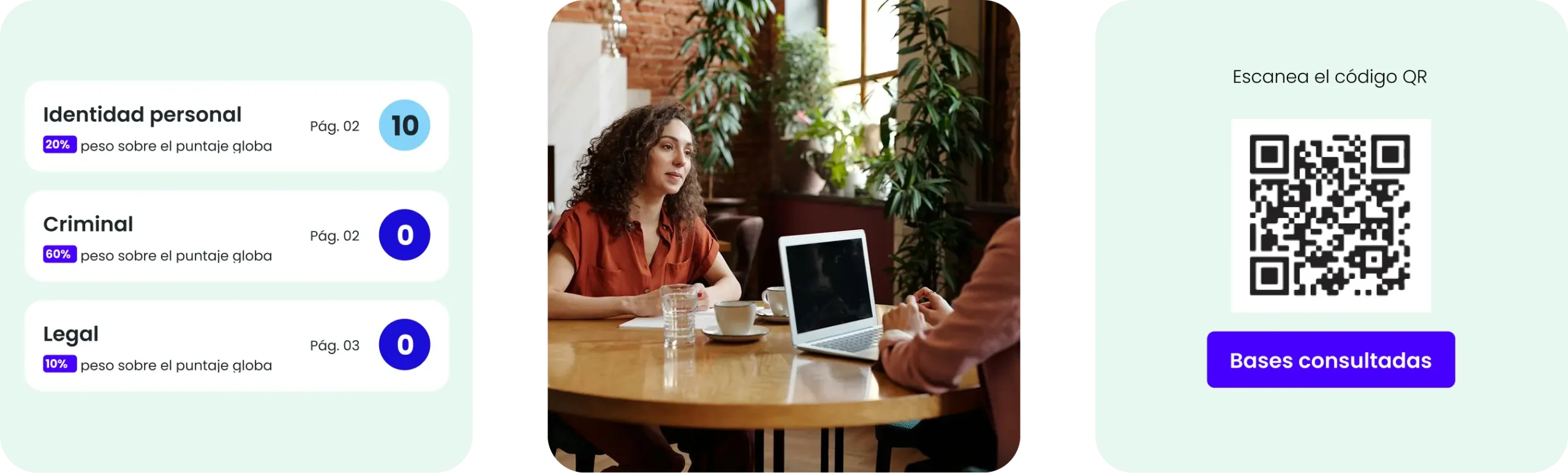
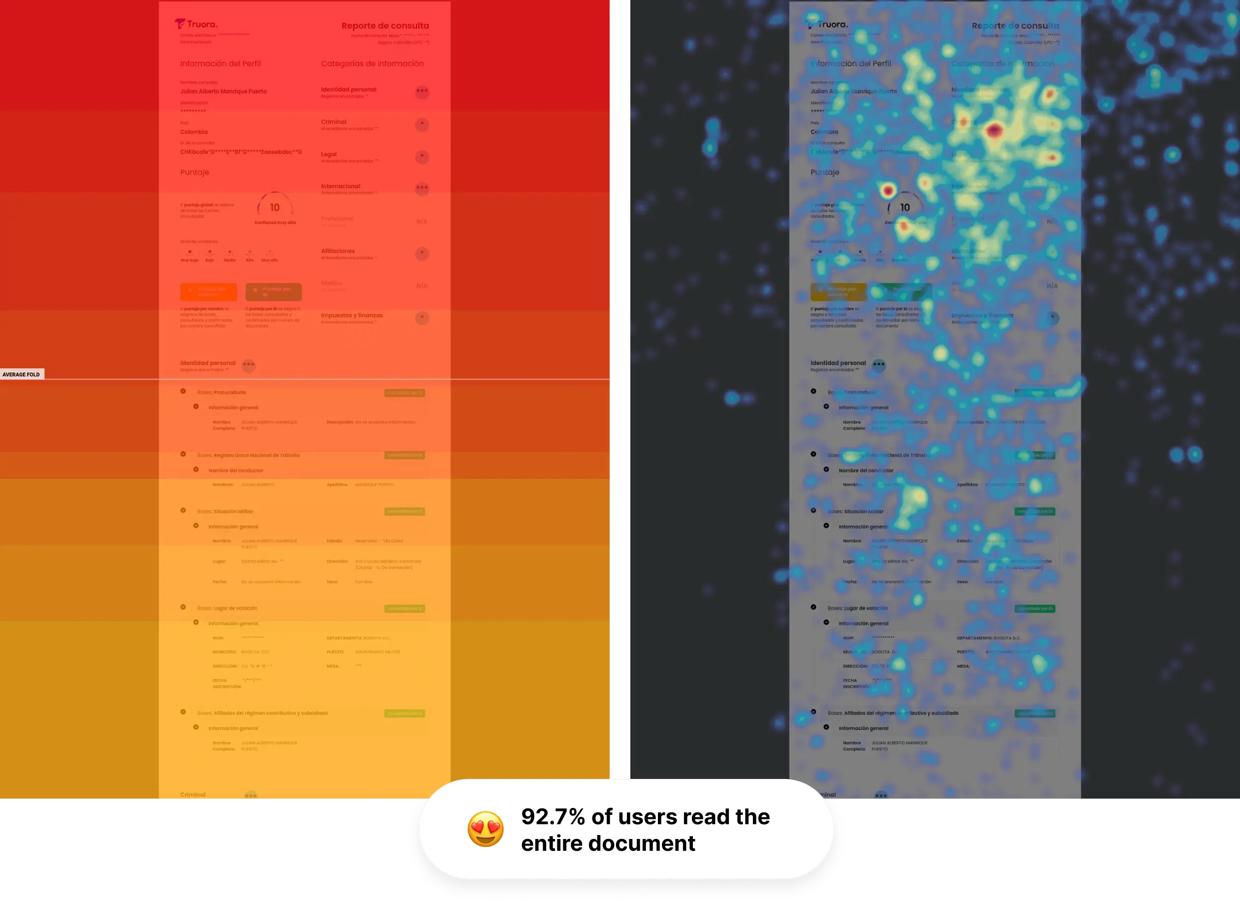
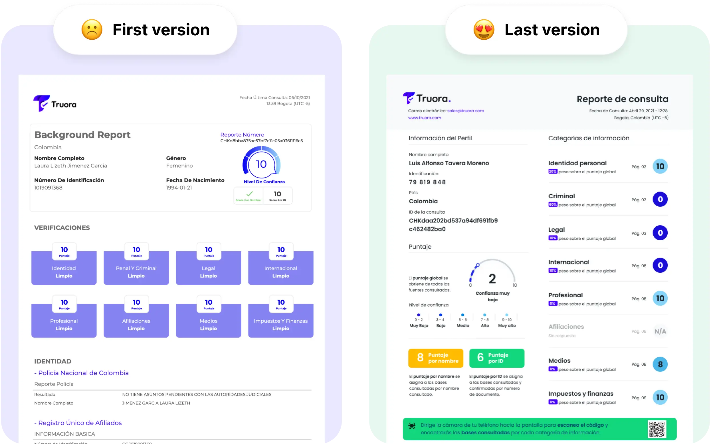
TruoraTruora Report Case Study: -50% Reading Time
Design case study for Truora's background check PDF report. Redesigned for non-technical users. Results: -50% reading time, +85% satisfaction
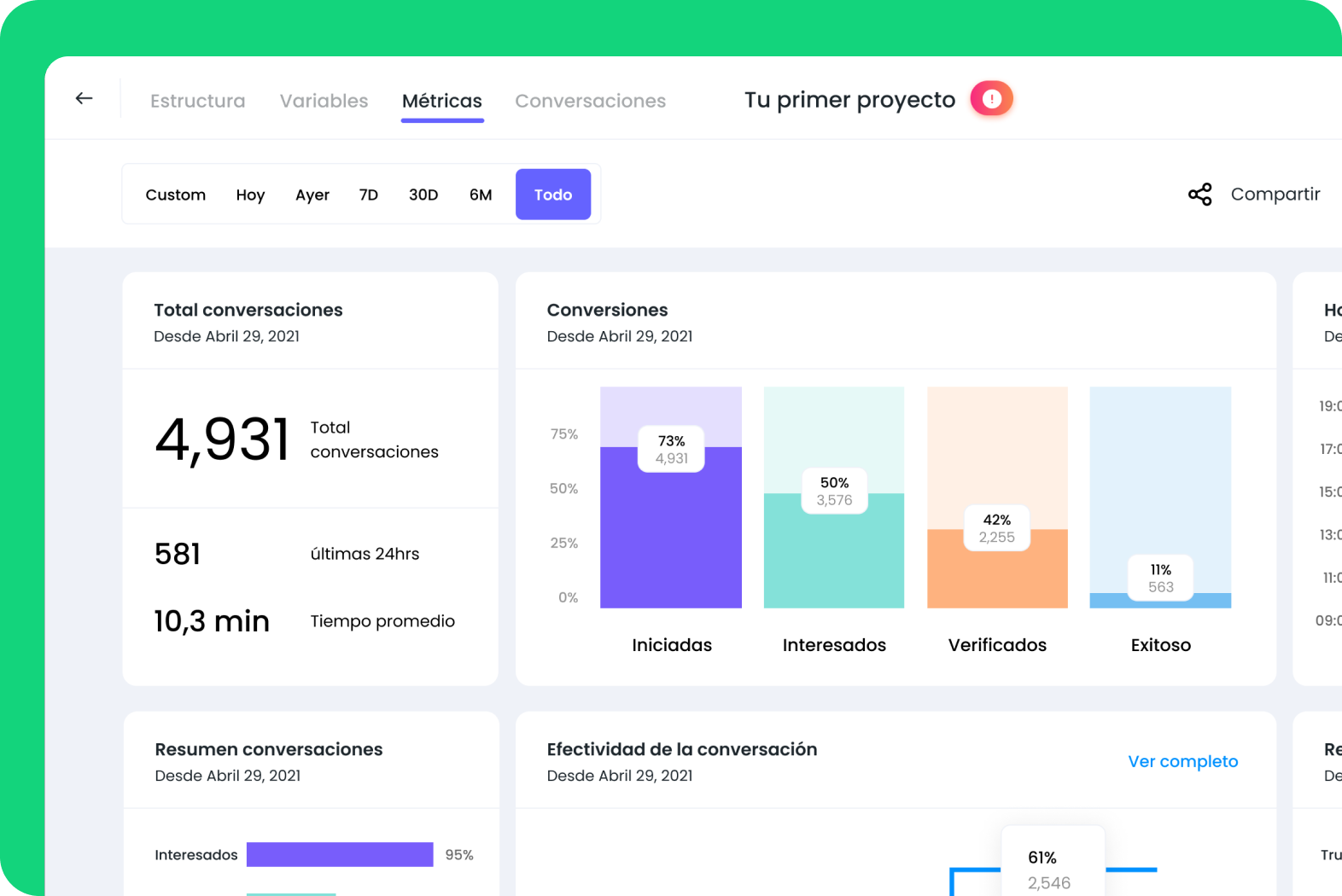
TruoraTruora TruConnect Case Study: WhatsApp Onboarding MVP
MVP for Truora TruConnect — a WhatsApp-based onboarding tool with chatbot conversations and biometric verification. Built MVP in 3 months
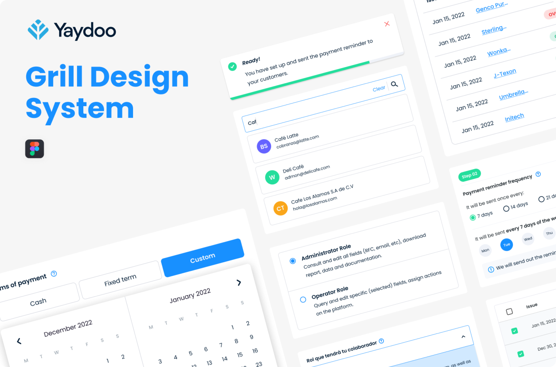
YaydooYaydoo Design System: +40% Productivity in 3 Months
Design system for Yaydoo. Organized 6+ products with brand and usability inconsistencies. Built Grill Design System with engineering team.
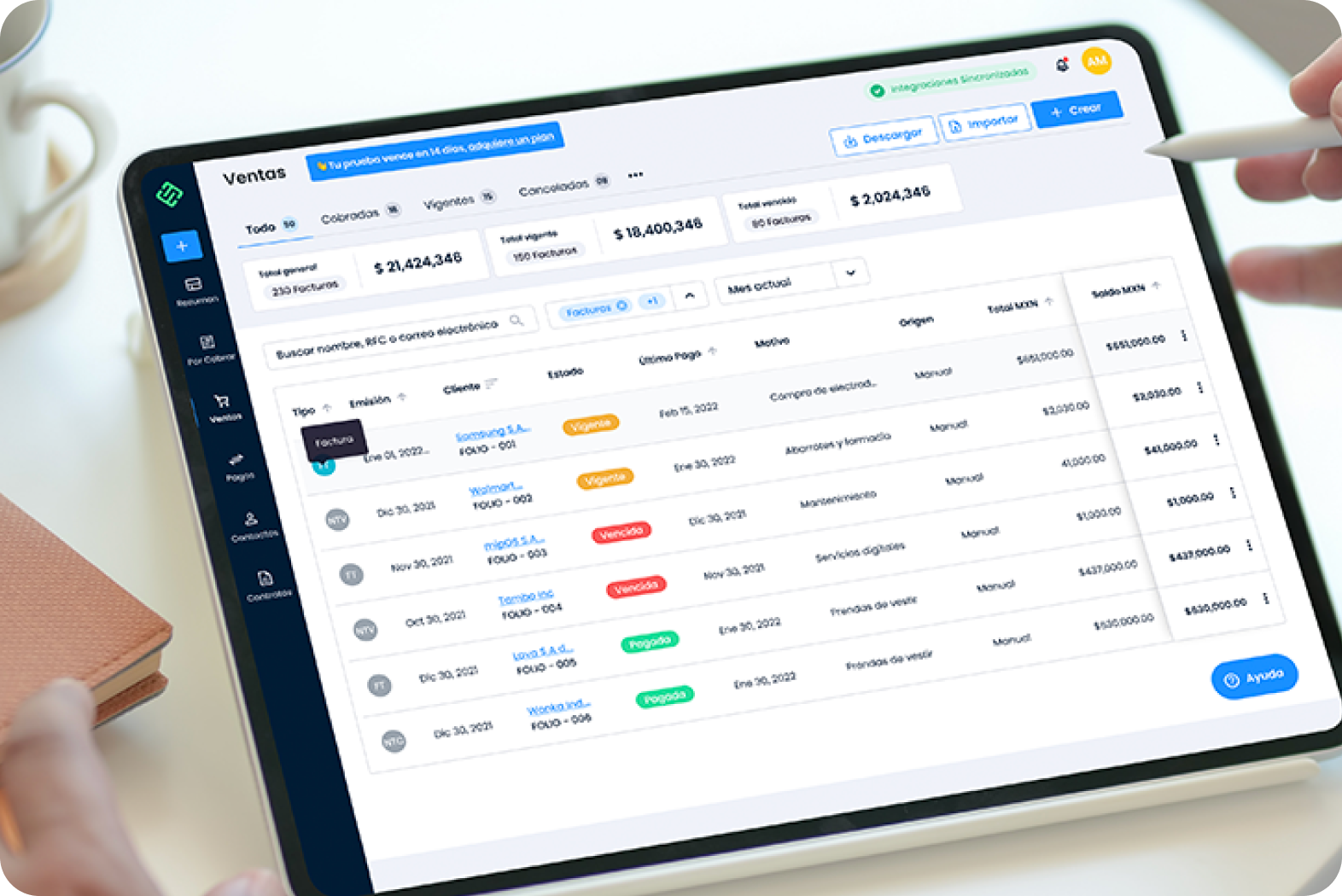
Yaydoo porCobrarYaydoo porCobrar: +40% New Users in 1 Week
UX redesign for Yaydoo porCobrar, a 2-year-old financial logbook product. Improved user experience drove +40% new user growth in one week.
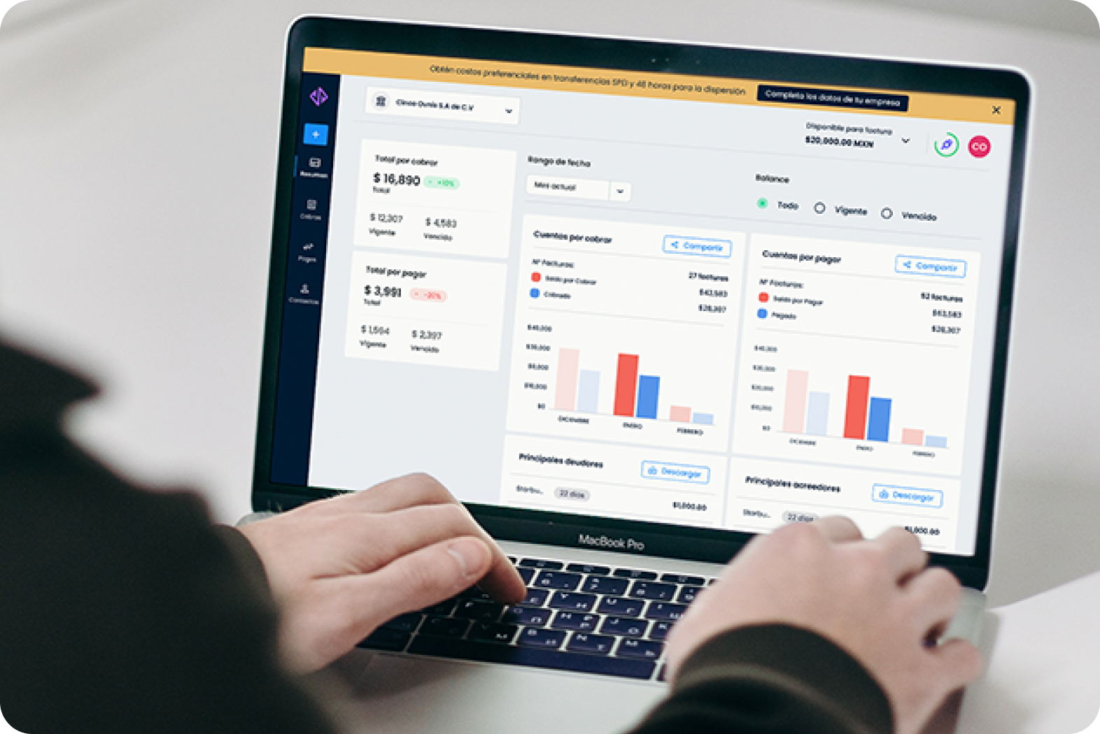
Yaydoo VendorplaceYaydoo Vendorplace: 2× User Registrations
UX optimization for Yaydoo Vendorplace during product-market fit phase. More than doubled registered users and improved retention by 15%.
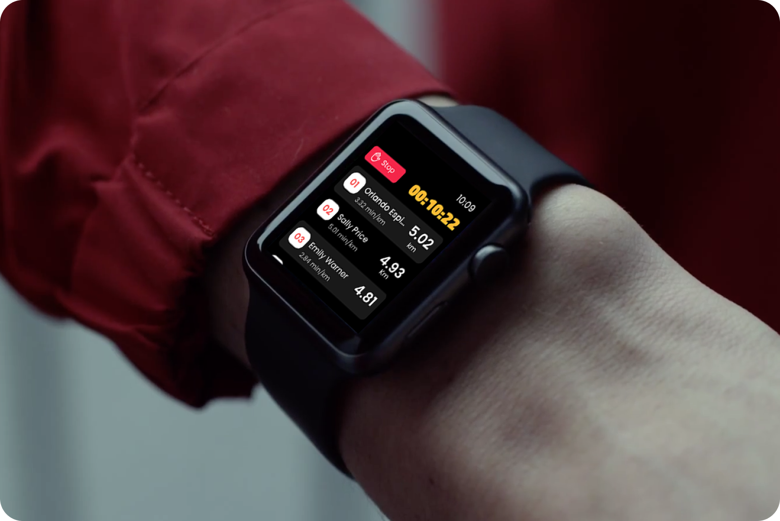
StadioStadio Case Study: Apple Watch Running App
Product design for Stadio, a social running app for Apple Watch. 30% new runner adoption in two weeks during the pandemic.
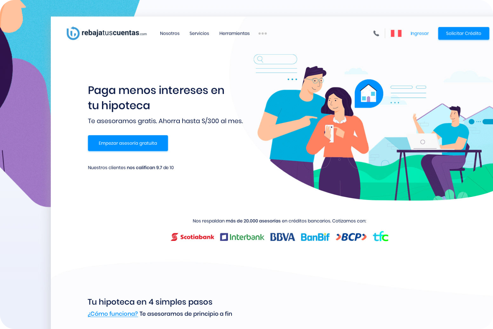
RebajaTusCuentasRebajaTusCuentas: +300% Growth, 3 Countries
PropTech product design for RebajaTusCuentas, a mortgage comparison platform. Full UX redesign drove +300% growth and expansion from Peru
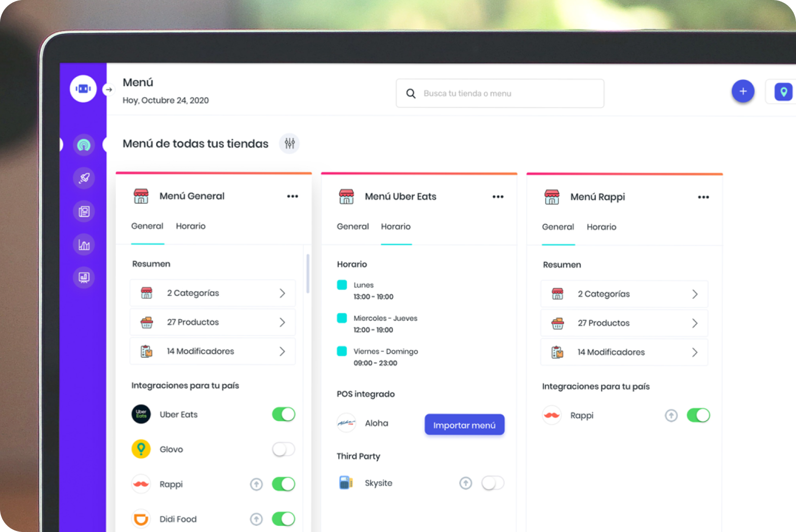
mipOS Dark KitchenmipOS Dark Kitchen: +400% Productivity
FoodTech product design for mipOS Dark Kitchen. Consolidated 40+ tablets from Uber Eats, Rappi, and Didi Food into one screen.
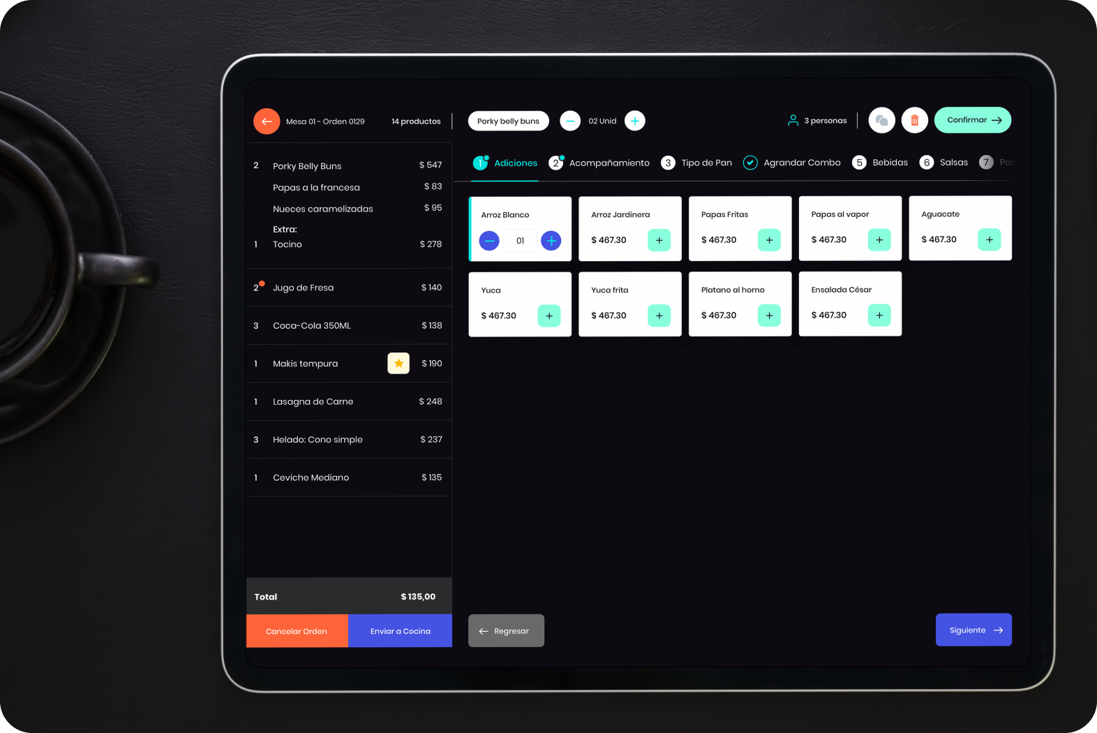
mipOS RestaurantsmipOS Restaurant POS: 70% Conversion Rate
POS system design for the next generation of restaurants. Modern point-of-sale supporting legacy operating systems.

